在现代Web应用中,下拉选择框(Dropdown Select)是实现用户输入和选项选择的重要UI组件。然而,传统的下拉选择框实现方式往往缺乏灵活性和交互性。本文将介绍如何结合DeepSeek和Vue框架,打造一款丝滑、智能且高度可定制的下拉选择框组件,为您的Web应用增添更多便捷和互动性。
📚页面效果

📚指令输入
已经创建好了一个基于Vue3的组合式API的项目(Composition API),并能正常运行起来,请帮我用 Vue3的组合式API(Composition API) 生成一个 下拉选择框(Dropdown Select) 的功能组件,所有代码都保存在components/DropdownSelect 下的文件夹中。功能组件的script标签中只有setup属性,使用普通 JavaScript 实现,不使用TypeScript。
功能要有,如下属性:
属性定义
数据相关属性
modelValue
类型:与选项值类型一致(如 String、Number 等)
作用:用于双向数据绑定,反映当前选中的选项值。
options
类型:Array
作用:存储下拉选择框的选项列表,每个选项可以是简单值,也可以是包含 label 和 value 属性的对象。
optionLabel
类型:String
作用:当 options 中的元素是对象时,指定用于显示的属性名。
optionValue
类型:String
作用:当 options 中的元素是对象时,指定作为值的属性名。
显示相关属性
placeholder
类型:String
作用:下拉框未选择时显示的提示文本。
disabled
类型:Boolean
作用:控制下拉选择框是否禁用,禁用状态下用户无法操作。
readonly
类型:Boolean
作用:设置下拉选择框为只读状态,用户只能查看已选内容,不能进行选择操作。
size
类型:String,可选值如 'small', 'medium', 'large'
作用:控制下拉选择框的大小。
multiple
类型:Boolean
作用:是否允许多选,若为 true,modelValue 应为数组。
maxSelected
类型:Number
作用:当 multiple 为 true 时,限制最多可选的选项数量。
样式相关属性
dropdownStyle
类型:Object 或 String
作用:自定义下拉列表的样式。
inputStyle
类型:Object 或 String
作用:自定义下拉框输入部分的样式。
过滤相关属性
filterable
类型:Boolean
作用:是否允许用户在下拉框中输入内容进行选项过滤。
filterPlaceholder
类型:String
作用:当 filterable 为 true 时,过滤输入框的占位提示文本。
事件定义
update:modelValue
作用:当选择的选项发生变化时触发,用于更新 modelValue 的值,实现双向数据绑定。
change
作用:选择的选项发生变化时触发,传递当前选中的值作为参数。
open
作用:下拉列表展开时触发。
close
作用:下拉列表关闭时触发。
filter
作用:当用户在过滤输入框中输入内容时触发,传递输入的过滤文本作为参数。
其他
组件设计
支持插槽:允许用户自定义下拉框的显示内容、选项内容等,增强组件的灵活性。
分组功能:支持对选项进行分组显示,提供更清晰的选项结构。
虚拟列表:当选项数量较多时,使用虚拟列表技术优化性能,减少 DOM 渲染压力。
键盘操作:支持使用键盘上下箭头选择选项、回车键确认选择等操作,提升用户体验。
文档和示例
详细文档:提供清晰的组件文档,包括属性说明、事件说明、使用示例等,方便其他开发者使用。
在线示例:提供在线的代码示例,让开发者可以直观地看到组件的效果和使用方法。
你有更好的建议也可以添加,要注明。组件定义好后给出5个及以上的调用示例。
下面是现有目录
vueAndDeepseek/
├── src/ # 源代码目录
│ ├── assets/ # 静态资源
│ │ ├── base.css
│ │ ├── main.css
│ │ └── logo.svg
│ ├── components/ # 组件目录
│ │ ├── HelloWorld.vue
│ │ ├── TheWelcome.vue
│ │ ├── WelcomeItem.vue
│ │ ├── Progress/
│ │ │ └── Progress.vue
│ │ ├── Accordion/
│ │ ├── BackToTop/
│ │ ├── Card/
│ │ ├── InfiniteScroll/
│ │ ├── Notification/
│ │ ├── Timeline/
│ │ ├── Switch/
│ │ ├── Tabs/
│ │ ├── Sidebar/
│ │ ├── Breadcrumbs/
│ │ ├── MasonryLayout/
│ │ ├── Rating/
│ │ ├── ColorPicker/
│ │ ├── RightClickMenu/
│ │ ├── RangePicker/
│ │ ├── Navbar/
│ │ ├── FormValidation/
│ │ ├── CopyToClipboard/
│ │ ├── ClickAnimations/
│ │ ├── ThumbnailList/
│ │ ├── KeyboardShortcuts/
│ │ ├── CommentSystem/
│ │ ├── QRCode/
│ │ ├── RadioButton/
│ │ ├── Slider/
│ │ ├── ScrollAnimations/
│ │ ├── TextInput/
│ │ ├── Divider/
│ │ ├── Checkbox/
│ │ ├── TagInput/
│ │ ├── DropdownSelect/
│ │ ├── DatePicker/
│ │ └── icons/
│ ├── router/ # 路由配置
│ │ └── index.js
│ ├── stores/ # Pinia 状态管理
│ │ └── counter.js
│ ├── views/ # 页面组件
│ │ ├── ProgressView.vue
│ │ ├── TabsView.vue
│ │ ├── SwitchView.vue
│ │ ├── TimelineView.vue
│ │ ├── NotificationView.vue
│ │ ├── CardView.vue
│ │ ├── InfiniteScrollView.vue
│ │ ├── BackToTopView.vue
│ │ ├── AccordionView.vue
│ │ ├── SidebarView.vue
│ │ ├── BreadcrumbsView.vue
│ │ ├── MasonryLayoutView.vue
│ │ ├── RatingView.vue
│ │ ├── ColorPickerView.vue
│ │ ├── RightClickMenuView.vue
│ │ ├── RangePickerView.vue
│ │ ├── NavbarView.vue
│ │ ├── FormValidationView.vue
│ │ ├── CopyToClipboardView.vue
│ │ ├── ClickAnimationsView.vue
│ │ ├── ThumbnailListView.vue
│ │ ├── KeyboardShortcutsView.vue
│ │ ├── CommentSystemView.vue
│ │ ├── QRCodeView.vue
│ │ ├── RadioButtonView.vue
│ │ ├── SliderView.vue
│ │ ├── ScrollAnimationsView.vue
│ │ ├── TextInputView.vue
│ │ ├── DividerView.vue
│ │ ├── CheckboxView.vue
│ │ ├── TagInputView.vue
│ │ ├── DropdownSelectView.vue
│ │ ├── DatePickerView.vue
│ │ └── AboutView.vue
│ ├── App.vue # 根组件
│ └── main.js # 应用入口
├── public/ # 公共资源目录
├── index.html # HTML 模板
├── package.json # 项目配置
├── vite.config.js # Vite 配置
└── node_modules/ # 依赖包目录
📚think
📘组件代码
我为您设计一个功能完善的DropdownSelect组件。以下是组件的实现步骤和代码:
🔨 组件实现思路:
使用组合式API处理响应式数据
通过computed处理选项的格式化显示
使用teleport处理下拉框的定位问题
通过键盘事件处理提升用户体验
使用Intersection Observer实现虚拟列表优化
📁 组件目录结构:
vueAndDeepseek/src/components/DropdownSelect/
├── index.js # 组件导出文件
└── DropdownSelect.vue # 组件主文件
📄 DropdownSelect.vue 代码:
<template>
  <div   :class="[size, { disabled, readonly }]">
    <!-- 触发区域 -->
    <div

      :
      @click="toggleDropdown"
      @keydown="handleTriggerKeydown"
      tabindex="0"
    >
      <slot name="trigger" :selected="selectedValue">
        <div class="selected-display">
          <template v-if="multiple">
            <span
              v-for="(item, index) in selectedItems"
              :key="index"

            >
              {{ getOptionLabel(item) }}
              <span
                v-if="!disabled && !readonly"

                @click.stop="removeTag(item)"
              >×</span>
            </span>
            <span v-if="!selectedItems.length" class="placeholder">
              {{ placeholder }}
            </span>
          </template>
          <template v-else>
            {{ selectedLabel || placeholder }}
          </template>
        </div>
        <div class="dropdown-indicator">▾</div>
      </slot>
    </div>

    <!-- 下拉菜单 -->
    <teleport to="body">
      <transition name="dropdown">
        <div
          v-show="isOpen"

          :
          @click.stop
        >
          <!-- 过滤输入框 -->
          <input
            v-if="filterable"
            v-model="filterText"

            :placeholder="filterPlaceholder"
            @input="handleFilterInput"
          />

          <!-- 选项列表 -->
          <div   ref="listRef">
            <template v-for="(option, index) in filteredOptions" :key="index">
              <!-- 分组处理 -->
              <div
                v-if="option.group"

              >
                <slot name="group" :group="option">
                  <div class="group-label">{{ option.group }}</div>
                </slot>
                <div
                  v-for="(item, i) in option.items"
                  :key="i"

                  :
                  @click="selectOption(item)"
                >
                  <slot name="option" :option="item">
                    {{ getOptionLabel(item) }}
                  </slot>
                </div>
              </div>
              <!-- 普通选项 -->
              <div
                v-else

                :
                @click="selectOption(option)"
              >
                <slot name="option" :option="option">
                  {{ getOptionLabel(option) }}
                </slot>
              </div>
            </template>
          </div>
        </div>
      </transition>
    </teleport>
  </div>
</template>

<script setup>
import { ref, computed, watch, onMounted, onUnmounted } from 'vue'

const props = defineProps({
  modelValue: [String, Number, Array, Object],
  options: {
    type: Array,
    default: () => []
  },
  optionLabel: {
    type: String,
    default: 'label'
  },
  optionValue: {
    type: String,
    default: 'value'
  },
  placeholder: String,
  disabled: Boolean,
  readonly: Boolean,
  size: {
    type: String,
    validator: v => ['small', 'medium', 'large'].includes(v),
    default: 'medium'
  },
  multiple: Boolean,
  maxSelected: Number,
  dropdownStyle: [Object, String],
  inputStyle: [Object, String],
  filterable: Boolean,
  filterPlaceholder: String
})

const emit = defineEmits([
  'update:modelValue',
  'change',
  'open',
  'close',
  'filter'
])

const isOpen = ref(false)
const filterText = ref('')
const listRef = ref(null)

// 计算选中项
const selectedValue = computed({
  get: () => props.modelValue,
  set: val => emit('update:modelValue', val)
})

// 处理选项显示标签
const getOptionLabel = option => {
  if (typeof option === 'object') {
    return option[props.optionLabel] || option.label || option.value
  }
  return option
}

// 处理选项实际值
const getOptionValue = option => {
  if (typeof option === 'object') {
    return option[props.optionValue] || option.value
  }
  return option
}

// 当前选中的选项对象
const selectedItems = computed(() => {
  if (!selectedValue.value) return []
  if (props.multiple) {
    return props.options.filter(opt =>
      selectedValue.value.includes(getOptionValue(opt))
    )
  }
  return props.options.find(opt =>
    getOptionValue(opt) === selectedValue.value
  )
})

// 当前显示标签(单选时)
const selectedLabel = computed(() => {
  if (props.multiple) return ''
  return selectedItems.value ? getOptionLabel(selectedItems.value) : ''
})

// 过滤后的选项
const filteredOptions = computed(() => {
  if (!props.filterable || !filterText.value) return props.options
  return props.options.filter(option => {
    const label = getOptionLabel(option).toLowerCase()
    return label.includes(filterText.value.toLowerCase())
  })
})

// 切换下拉框
const toggleDropdown = () => {
  if (props.disabled || props.readonly) return
  isOpen.value = !isOpen.value
  if (isOpen.value) {
    emit('open')
  } else {
    emit('close')
  }
}

// 选择选项
const selectOption = option => {
  if (option.disabled) return

  const value = getOptionValue(option)

  if (props.multiple) {
    const current = Array.isArray(selectedValue.value)
      ? selectedValue.value
      : []
    const index = current.indexOf(value)

    if (index > -1) {
      current.splice(index, 1)
    } else {
      if (props.maxSelected && current.length >= props.maxSelected) return
      current.push(value)
    }
    selectedValue.value = [...current]
  } else {
    selectedValue.value = value
    isOpen.value = false
  }

  emit('change', selectedValue.value)
}

// 移除标签(多选时)
const removeTag = item => {
  if (props.disabled || props.readonly) return
  const value = getOptionValue(item)
  selectedValue.value = selectedValue.value.filter(v => v !== value)
}

// 处理过滤输入
const handleFilterInput = e => {
  emit('filter', e.target.value)
}

// 处理键盘事件
const handleTriggerKeydown = e => {
  if (props.disabled || props.readonly) return

  switch(e.key) {
    case 'ArrowDown':
    case 'Enter':
      isOpen.value = true
      e.preventDefault()
      break
    case 'Escape':
      isOpen.value = false
      break
  }
}

// 点击外部关闭
const clickOutsideHandler = e => {
  if (!isOpen.value) return
  if (!e.target.closest('.dropdown-select')) {
    isOpen.value = false
    emit('close')
  }
}

// 生命周期
onMounted(() => {
  document.addEventListener('click', clickOutsideHandler)
})

onUnmounted(() => {
  document.removeEventListener('click', clickOutsideHandler)
})
</script>

<style scoped>
/* 这里需要添加详细的样式代码 */
.dropdown-select {
  position: relative;
  width: 100%;
  max-width: 300px;
}
.select-trigger {
  border: 1px solid #ccc;
  padding: 8px;
  cursor: pointer;
  display: flex;
  justify-content: space-between;
  align-items: center;
}
.dropdown-menu {
  position: absolute;
  border: 1px solid #ccc;
  background: white;
  width: 100%;
  max-height: 200px;
  overflow-y: auto;
  z-index: 1000;
}
.option-item {
  padding: 8px;
  cursor: pointer;
}
.option-item:hover {
  background: #f0f0f0;
}
.selected {
  background: #e0f0ff;
}
.disabled {
  opacity: 0.6;
  cursor: not-allowed;
}
</style>
📄 index.js 导出文件:
import DropdownSelect from './DropdownSelect.vue'

export default DropdownSelect
5个调用示例:
基础使用:
<DropdownSelect
  v-model="selectedValue"
  :options="['Apple', 'Banana', 'Orange']"
  placeholder="Select a fruit"
/>
对象选项多选:
<DropdownSelect
  v-model="selectedValues"
  :options="[
    { id: 1, name: '北京' },
    { id: 2, name: '上海' },
    { id: 3, name: '广州' }
  ]"
  option-label="name"
  option-value="id"
  multiple
  placeholder="选择城市"
/>
过滤和分组:
<DropdownSelect
  v-model="selectedCar"
  :options="[
    { group: '德国车', items: [
      { value: 'bmw', label: '宝马' },
      { value: 'benz', label: '奔驰' }
    ]},
    { group: '日本车', items: [
      { value: 'toyota', label: '丰田' }
    ]}
  ]"
  filterable
  filter-placeholder="搜索车型"
/>
禁用状态:
<DropdownSelect
  v-model="selectedItem"
  :options="options"
  disabled
  placeholder="禁用状态"
/>
自定义样式和插槽:
<DropdownSelect
  v-model="selected"
  :options="users"
  option-label="fullName"
  option-value="id"
  :input-style="{ border: '2px solid #4CAF50' }"
>
  <template #option="{ option }">
    <div style="display: flex; align-items: center">
      <img
        :src="https://blog.csdn.net/qq_33650655/article/details/option.avatar"

      >
      {{ option.fullName }}
    </div>
  </template>
</DropdownSelect>
💡 附加建议:
可以添加loading状态显示加载指示器
增加远程搜索功能(当选项需要异步加载时)
添加选项的图标支持
支持选项的自定义排序
添加输入框的清除按钮
支持选项的创建功能(允许用户输入新值)
实现时需要注意:
使用Teleport解决下拉框的定位问题
多选时的性能优化(特别是大量选项时)
严格的类型检查(虽然不用TS但需要验证props)
完善的键盘导航支持
无障碍访问(ARIA属性)
📚代码测试
有一个报错。
DropdownSelect.vue:86 Uncaught (in promise) TypeError: _ctx.isSelected is not a function
    at DropdownSelect.vue:86:58
    at renderList (chunk-U3LI7FBV.js?v=c715b44f:4988:16)
    at DropdownSelect.vue:1:1
    at Proxy.renderFnWithContext (chunk-U3LI7FBV.js?v=c715b44f:2763:13)
    at Proxy.<anonymous> (chunk-U3LI7FBV.js?v=c715b44f:3233:79)
    at renderComponentRoot (chunk-U3LI7FBV.js?v=c715b44f:8581:17)
    at ReactiveEffect.componentUpdateFn [as fn] (chunk-U3LI7FBV.js?v=c715b44f:7403:46)
    at ReactiveEffect.run (chunk-U3LI7FBV.js?v=c715b44f:481:19)
    at setupRenderEffect (chunk-U3LI7FBV.js?v=c715b44f:7538:5)
    at mountComponent (chunk-U3LI7FBV.js?v=c715b44f:7313:7)
原因:没有isSelected 。
解决:添加isSelected 。
// 判断选项是否被选中
const isSelected = option => {
  if (props.multiple) {
    return selectedValue.value.includes(getOptionValue(option))
  }
  return getOptionValue(option) === selectedValue.value
}
📚整理后主要全部代码 \src\components\DropdownSelect\DropdownSelect.vue
<template>
  <div   :class="[size, { disabled, readonly }]">
    <!-- 触发区域 -->
    <div

        :
        @click="toggleDropdown"
        @keydown="handleTriggerKeydown"
        tabindex="0"
    >
      <slot name="trigger" :selected="selectedValue">
        <div class="selected-display">
          <template v-if="multiple">
            <span
                v-for="(item, index) in selectedItems"
                :key="index"

            >
              {{ getOptionLabel(item) }}
              <span
                  v-if="!disabled && !readonly"

                  @click.stop="removeTag(item)"
              >×</span>
            </span>
            <span v-if="!selectedItems.length" class="placeholder">
              {{ placeholder }}
            </span>
          </template>
          <template v-else>
            {{ selectedLabel || placeholder }}
          </template>
        </div>
        <div class="dropdown-indicator">▾</div>
      </slot>
    </div>

    <!-- 下拉菜单 -->
    <teleport to="body">
      <transition name="dropdown">
        <div
            v-show="isOpen"

            :
            @click.stop
        >
          <!-- 过滤输入框 -->
          <input
              v-if="filterable"
              v-model="filterText"

              :placeholder="filterPlaceholder"
              @input="handleFilterInput"
          />

          <!-- 选项列表 -->
          <div   ref="listRef">
            <template v-for="(option, index) in filteredOptions" :key="index">
              <!-- 分组处理 -->
              <div
                  v-if="option.group"

              >
                <slot name="group" :group="option">
                  <div class="group-label">{{ option.group }}</div>
                </slot>
                <div
                    v-for="(item, i) in option.items"
                    :key="i"

                    :
                    @click="selectOption(item)"
                >
                  <slot name="option" :option="item">
                    {{ getOptionLabel(item) }}
                  </slot>
                </div>
              </div>
              <!-- 普通选项 -->
              <div
                  v-else

                  :
                  @click="selectOption(option)"
              >
                <slot name="option" :option="option">
                  {{ getOptionLabel(option) }}
                </slot>
              </div>
            </template>
          </div>
        </div>
      </transition>
    </teleport>
  </div>
</template>

<script setup>
import { ref, computed, watch, onMounted, onUnmounted } from 'vue'

const props = defineProps({
  modelValue: [String, Number, Array, Object],
  options: {
    type: Array,
    default: () => []
  },
  optionLabel: {
    type: String,
    default: 'label'
  },
  optionValue: {
    type: String,
    default: 'value'
  },
  placeholder: String,
  disabled: Boolean,
  readonly: Boolean,
  size: {
    type: String,
    validator: v => ['small', 'medium', 'large'].includes(v),
    default: 'medium'
  },
  multiple: Boolean,
  maxSelected: Number,
  dropdownStyle: [Object, String],
  inputStyle: [Object, String],
  filterable: Boolean,
  filterPlaceholder: String
})

const emit = defineEmits([
  'update:modelValue',
  'change',
  'open',
  'close',
  'filter'
])

const isOpen = ref(false)
const filterText = ref('')
const listRef = ref(null)

// 计算选中项
const selectedValue = computed({
  get: () => props.modelValue,
  set: val => emit('update:modelValue', val)
})

// 处理选项显示标签
const getOptionLabel = option => {
  if (typeof option === 'object') {
    return option[props.optionLabel] || option.label || option.value
  }
  return option
}

// 处理选项实际值
const getOptionValue = option => {
  if (typeof option === 'object') {
    return option[props.optionValue] || option.value
  }
  return option
}

// 当前选中的选项对象
const selectedItems = computed(() => {
  if (!selectedValue.value) return []
  if (props.multiple) {
    return props.options.filter(opt =>
        selectedValue.value.includes(getOptionValue(opt))
    )
  }
  return props.options.find(opt =>
      getOptionValue(opt) === selectedValue.value
  )
})

// 当前显示标签(单选时)
const selectedLabel = computed(() => {
  if (props.multiple) return ''
  return selectedItems.value ? getOptionLabel(selectedItems.value) : ''
})

// 过滤后的选项
const filteredOptions = computed(() => {
  if (!props.filterable || !filterText.value) return props.options
  return props.options.filter(option => {
    const label = getOptionLabel(option).toLowerCase()
    return label.includes(filterText.value.toLowerCase())
  })
})

// 判断选项是否被选中
const isSelected = option => {
  if (props.multiple) {
    return selectedValue.value.includes(getOptionValue(option))
  }
  return getOptionValue(option) === selectedValue.value
}

// 切换下拉框
const toggleDropdown = () => {
  if (props.disabled || props.readonly) return
  isOpen.value = !isOpen.value
  if (isOpen.value) {
    emit('open')
  } else {
    emit('close')
  }
}

// 选择选项
const selectOption = option => {
  if (option.disabled) return

  const value = getOptionValue(option)

  if (props.multiple) {
    const current = Array.isArray(selectedValue.value)
        ? selectedValue.value
        : []
    const index = current.indexOf(value)

    if (index > -1) {
      current.splice(index, 1)
    } else {
      if (props.maxSelected && current.length >= props.maxSelected) return
      current.push(value)
    }
    selectedValue.value = [...current]
  } else {
    selectedValue.value = value
    isOpen.value = false
  }

  emit('change', selectedValue.value)
}

// 移除标签(多选时)
const removeTag = item => {
  if (props.disabled || props.readonly) return
  const value = getOptionValue(item)
  selectedValue.value = selectedValue.value.filter(v => v !== value)
}

// 处理过滤输入
const handleFilterInput = e => {
  emit('filter', e.target.value)
}

// 处理键盘事件
const handleTriggerKeydown = e => {
  if (props.disabled || props.readonly) return

  switch(e.key) {
    case 'ArrowDown':
    case 'Enter':
      isOpen.value = true
      e.preventDefault()
      break
    case 'Escape':
      isOpen.value = false
      break
  }
}

// 点击外部关闭
const clickOutsideHandler = e => {
  if (!isOpen.value) return
  if (!e.target.closest('.dropdown-select')) {
    isOpen.value = false
    emit('close')
  }
}

// 生命周期
onMounted(() => {
  document.addEventListener('click', clickOutsideHandler)
})

onUnmounted(() => {
  document.removeEventListener('click', clickOutsideHandler)
})
</script>

<style scoped>
/* 这里需要添加详细的样式代码 */
.dropdown-select {
  position: relative;
  width: 100%;
  max-width: 300px;
}
.select-trigger {
  border: 1px solid #ccc;
  padding: 8px;
  cursor: pointer;
  display: flex;
  justify-content: space-between;
  align-items: center;
}
.dropdown-menu {
  position: absolute;
  border: 1px solid #ccc;
  background: white;
  width: 100%;
  max-height: 200px;
  overflow-y: auto;
  z-index: 1000;
}
.option-item {
  padding: 8px;
  cursor: pointer;
}
.option-item:hover {
  background: #f0f0f0;
}
.selected {
  background: #e0f0ff;
}
.disabled {
  opacity: 0.6;
  cursor: not-allowed;
}
</style>
📚测试代码正常跑通,附其他基本代码
添加路由
页面展示入口
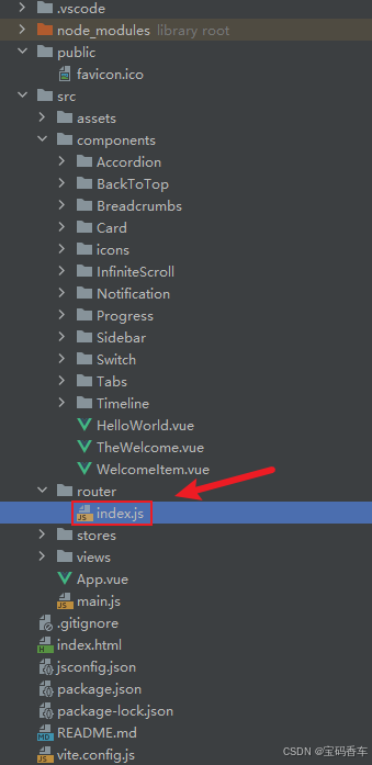
📘编写路由 \src\router\index.js
import { createRouter, createWebHistory } from 'vue-router'
import RightClickMenuView from '../views/RightClickMenuView.vue'
import RangePickerView from '../views/RangePickerView.vue'
const router = createRouter({
history: createWebHistory(import.meta.env.BASE_URL),
routes: [
{
path: '/',
name: 'progress',
component: () => import('../views/ProgressView.vue'),
},
{
path: '/tabs',
name: 'tabs',
// route level code-splitting
// this generates a separate chunk (About.[hash].js) for this route
// which is lazy-loaded when the route is visited.
// 标签页(Tabs)
component: () => import('../views/TabsView.vue'),
},
{
path: '/accordion',
name: 'accordion',
// 折叠面板(Accordion)
component: () => import('../views/AccordionView.vue'),
},
{
path: '/timeline',
name: 'timeline',
// 时间线(Timeline)
component: () => import('../views/TimelineView.vue'),
},
{
path: '/backToTop',
name: 'backToTop',
component: () => import('../views/BackToTopView.vue')
},
{
path: '/notification',
name: 'notification',
component: () => import('../views/NotificationView.vue')
},
{
path: '/card',
name: 'card',
component: () => import('../views/CardView.vue')
},
{
path: '/infiniteScroll',
name: 'infiniteScroll',
component: () => import('../views/InfiniteScrollView.vue')
},
{
path: '/switch',
name: 'switch',
component: () => import('../views/SwitchView.vue')
},
{
path: '/sidebar',
name: 'sidebar',
component: () => import('../views/SidebarView.vue')
},
{
path: '/breadcrumbs',
name: 'breadcrumbs',
component: () => import('../views/BreadcrumbsView.vue')
},
{
path: '/masonryLayout',
name: 'masonryLayout',
component: () => import('../views/MasonryLayoutView.vue')
},
{
path: '/rating',
name: 'rating',
component: () => import('../views/RatingView.vue')
},
{
path: '/datePicker',
name: 'datePicker',
component: () => import('../views/DatePickerView.vue')
},
{
path: '/colorPicker',
name: 'colorPicker',
component: () => import('../views/ColorPickerView.vue')
},
{
path: '/rightClickMenu',
name: 'rightClickMenu',
component: RightClickMenuView
},
{
path: '/rangePicker',
name: 'rangePicker',
component: () => import('../views/RangePickerView.vue')
},
{
path: '/navbar',
name: 'navbar',
component: () => import('../views/NavbarView.vue')
},
{
path: '/formValidation',
name: 'formValidation',
component: () => import('../views/FormValidationView.vue')
},
{
path: '/copyToClipboard',
name: 'copyToClipboard',
component: () => import('../views/CopyToClipboardView.vue')
},
{
path: '/clickAnimations',
name: 'clickAnimations',
component: () => import('../views/ClickAnimationsView.vue')
},
{
path: '/thumbnailList',
name: 'thumbnailList',
component: () => import('../views/ThumbnailListView.vue')
},
{
path: '/keyboardShortcuts',
name: 'keyboardShortcuts',
component: () => import('../views/KeyboardShortcutsView.vue')
},
{
path: '/commentSystem',
name: 'commentSystem',
component: () => import('../views/CommentSystemView.vue')
},
{
path: '/qRCode',
name: 'qRCode',
component: () => import('../views/QRCodeView.vue')
},
{
path: '/radioButton',
name: 'radioButton',
component: () => import('../views/RadioButtonView.vue')
},
{
path: '/slider',
name: 'slider',
component: () => import('../views/SliderView.vue')
},
{
path: '/scrollAnimations',
name: 'scrollAnimations',
component: () => import('../views/ScrollAnimationsView.vue')
},
{
path: '/textInputView',
name: 'textInputView',
component: () => import('../views/TextInputView.vue')
},
{
path: '/divider',
name: 'divider',
component: () => import('../views/DividerView.vue')
},
{
path: '/checkbox',
name: 'checkbox',
component: () => import('../views/CheckboxView.vue')
},
{
path: '/tagInput',
name: 'tagInput',
component: () => import('../views/TagInputView.vue')
},
{
path: '/dropdownSelect',
name: 'dropdownSelect',
component: () => import('../views/DropdownSelectView.vue')
}
],
})
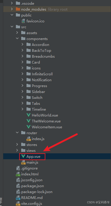
export default router📘编写展示入口 \src\App.vue
<script setup>
import { RouterLink, RouterView } from 'vue-router'
import HelloWorld from './components/HelloWorld.vue'
</script>

<template>
  <header>
    <img alt="Vue logo"   src="https://blog.csdn.net/qq_33650655/article/details/@/assets/logo.svg"     />

    <div class="wrapper">
      <HelloWorld msg="You did it!" />
      <nav>
        <RouterLink to="/">Progress</RouterLink>
        <RouterLink to="/tabs">Tabs</RouterLink>
        <RouterLink to="/accordion">Accordion</RouterLink>
        <RouterLink to="/timeline">Timeline</RouterLink>
        <RouterLink to="/backToTop">BackToTop</RouterLink>
        <RouterLink to="/notification">Notification</RouterLink>
        <RouterLink to="/card">Card</RouterLink>
        <RouterLink to="/infiniteScroll">InfiniteScroll</RouterLink>
        <RouterLink to="/switch">Switch</RouterLink>
        <RouterLink to="/sidebar">Sidebar</RouterLink>
        <RouterLink to="/breadcrumbs">Breadcrumbs</RouterLink>
        <RouterLink to="/masonryLayout">MasonryLayout</RouterLink>
        <RouterLink to="/rating">Rating</RouterLink>
        <RouterLink to="/datePicker">DatePicker</RouterLink>
        <RouterLink to="/colorPicker">ColorPicker</RouterLink>
        <RouterLink to="/rightClickMenu">RightClickMenu</RouterLink>
        <RouterLink to="/rangePicker">RangePicker</RouterLink>
        <RouterLink to="/navbar">Navbar</RouterLink>
        <RouterLink to="/formValidation">FormValidation</RouterLink>
        <RouterLink to="/copyToClipboard">CopyToClipboard</RouterLink>
        <RouterLink to="/clickAnimations">ClickAnimations</RouterLink>
        <RouterLink to="/thumbnailList">ThumbnailList</RouterLink>
        <RouterLink to="/keyboardShortcuts">KeyboardShortcuts</RouterLink>
        <RouterLink to="/commentSystem">CommentSystem</RouterLink>
        <RouterLink to="/qRCode">QRCode</RouterLink>
        <RouterLink to="/radioButton">RadioButton</RouterLink>
        <RouterLink to="/slider">Slider</RouterLink>
        <RouterLink to="/scrollAnimations">ScrollAnimations</RouterLink>
        <RouterLink to="/textInputView">TextInput</RouterLink>
        <RouterLink to="/divider">Divider</RouterLink>
        <RouterLink to="/checkbox">Checkbox</RouterLink>
        <RouterLink to="/tagInput">TagInput</RouterLink>
        <RouterLink to="/dropdownSelect">DropdownSelect</RouterLink>
      </nav>
    </div>
  </header>

  <RouterView />
</template>

<style scoped>
header {
  line-height: 1.5;
  max-height: 100vh;
}

.logo {
  display: block;
  margin: 0 auto 2rem;
}

nav {
  width: 100%;
  font-size: 12px;
  text-align: center;
  margin-top: 2rem;
}

nav a.router-link-exact-active {
  color: var(--color-text);
}

nav a.router-link-exact-active:hover {
  background-color: transparent;
}

nav a {
  display: inline-block;
  padding: 0 1rem;
  border-left: 1px solid var(--color-border);
}

nav a:first-of-type {
  border: 0;
}

@media (min-width: 1024px) {
  header {
    display: flex;
    place-items: center;
    padding-right: calc(var(--section-gap) / 2);
  }

  .logo {
    margin: 0 2rem 0 0;
  }

  header .wrapper {
    display: flex;
    place-items: flex-start;
    flex-wrap: wrap;
  }

  nav {
    text-align: left;
    margin-left: -1rem;
    font-size: 1rem;

    padding: 1rem 0;
    margin-top: 1rem;
  }
}
</style>
总结
通过结合DeepSeek的强大搜索和推荐能力,以及Vue框架的响应式和组件化特性,我们成功打造了一款丝滑、智能且高度可定制的下拉选择框组件。这款组件不仅能够根据用户操作动态调整选项和样式,还能与用户交互,提供更加个性化的体验。希望本文的介绍能够为您的Web开发带来新的灵感和思路,让您的应用在细节之处更加出彩。
本文来源于#宝码香车,由@蜜芽 整理发布。如若内容造成侵权/违法违规/事实不符,请联系本站客服处理!
该文章观点仅代表作者本人,不代表本站立场。本站不承担相关法律责任。
如若转载,请注明出处:https://www.zhanid.com/biancheng/3496.html
")
")

")
")