在现代Web和移动应用中,悬浮按钮(Floating Action Button,简称FAB)已经成为一种流行的设计元素。它通常用于触发主要操作,如添加新项、分享内容等。悬浮按钮不仅美观,还能显著提升用户体验。本文将介绍如何结合DeepSeek和Vue框架,打造丝滑的悬浮按钮。DeepSeek是一款强大的搜索和推荐引擎,可以帮助开发者快速找到所需的组件和示例代码,而Vue则以其简洁的语法和高效的性能,成为构建动态Web应用的理想选择。
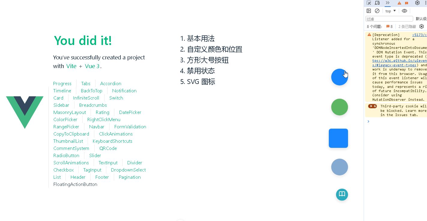
📚页面效果
📚指令输入
已经创建好了一个基于Vue3的组合式API的项目(Composition API),并能正常运行起来,请帮我用 Vue3的组合式API(Composition API) 生成一个 悬浮按钮(Floating Action Button) 的功能组件,所有代码都保存在components/FloatingActionButton 下的文件夹中。功能组件的script标签中只有setup属性,使用普通 JavaScript 实现,不使用TypeScript。
功能要有,如下属性:
属性定义
1. 外观相关
icon
说明:设置悬浮按钮上显示的图标,可以是图标库的类名或者 SVG 图标代码。
类型:字符串
默认值:空字符串
color
说明:设置按钮的背景颜色。
类型:字符串(CSS 颜色值)
默认值:常见的主题色,如 #007bff
textColor
说明:设置按钮内文字或图标的颜色。
类型:字符串(CSS 颜色值)
默认值:#fff
size
说明:设置按钮的大小,如小、中、大。
类型:字符串,可选值为 small、medium、large 等
默认值:medium
shape
说明:设置按钮的形状,如圆形、方形等。
类型:字符串,可选值为 circle、square 等
默认值:circle
2. 位置相关
position
说明:设置按钮的悬浮位置,如右下角、左下角等。
类型:字符串,可选值为 bottom-right、bottom-left、top-right、top-left 等
默认值:bottom-right
offsetX
说明:按钮相对于默认位置在 X 轴上的偏移量。
类型:数字
默认值:0
offsetY
说明:按钮相对于默认位置在 Y 轴上的偏移量。
类型:数字
默认值:0
3. 交互相关
disabled
说明:设置按钮是否禁用。
类型:布尔值
默认值:false
tooltip
说明:设置鼠标悬停在按钮上时显示的提示信息。
类型:字符串
默认值:空字符串
4. 动画相关
animate
说明:设置按钮是否开启动画效果,如淡入淡出、缩放等。
类型:布尔值
默认值:true
animationType
说明:设置动画的类型。
类型:字符串,可选值为 fade、scale 等
默认值:fade
事件定义
click
说明:当按钮被点击时触发该事件,可用于执行特定的操作,如打开模态框、提交表单等。
参数:无
mouseenter
说明:当鼠标进入按钮区域时触发该事件,可用于显示提示信息或执行一些动画效果。
参数:无
mouseleave
说明:当鼠标离开按钮区域时触发该事件,可用于隐藏提示信息或恢复动画效果。
参数:无
其他
可访问性:为按钮添加 aria-label 属性,确保屏幕阅读器能够正确识别按钮的功能;同时,为按钮添加适当的焦点样式,方便键盘操作。
响应式设计:考虑按钮在不同屏幕尺寸下的显示效果,例如在小屏幕上调整按钮的大小和位置。
动画优化:合理设置动画的时长和缓动函数,避免动画过于生硬或影响性能。
嵌套使用:支持在按钮内部嵌套其他组件,如 Badge 组件,以显示额外的信息。
事件代理:如果有多个悬浮按钮,可以考虑使用事件代理来处理点击事件,提高性能。
你有更好的建议也可以添加,要注明。组件定义好后给出5个及以上的调用示例。
下面是现有目录
vueAndDeepseek/
├── src/ # 源代码目录
│ ├── assets/ # 静态资源
│ │ ├── base.css
│ │ ├── main.css
│ │ └── logo.svg
│ ├── components/ # 组件目录
│ │ ├── HelloWorld.vue
│ │ ├── TheWelcome.vue
│ │ ├── WelcomeItem.vue
│ │ ├── Progress/
│ │ │ └── Progress.vue
│ │ ├── Accordion/
│ │ ├── BackToTop/
│ │ ├── Card/
│ │ ├── InfiniteScroll/
│ │ ├── Notification/
│ │ ├── Timeline/
│ │ ├── Switch/
│ │ ├── Tabs/
│ │ ├── Sidebar/
│ │ ├── Breadcrumbs/
│ │ ├── MasonryLayout/
│ │ ├── Rating/
│ │ ├── ColorPicker/
│ │ ├── RightClickMenu/
│ │ ├── RangePicker/
│ │ ├── Navbar/
│ │ ├── FormValidation/
│ │ ├── CopyToClipboard/
│ │ ├── ClickAnimations/
│ │ ├── ThumbnailList/
│ │ ├── KeyboardShortcuts/
│ │ ├── CommentSystem/
│ │ ├── QRCode/
│ │ ├── RadioButton/
│ │ ├── Slider/
│ │ ├── ScrollAnimations/
│ │ ├── TextInput/
│ │ ├── Divider/
│ │ ├── Checkbox/
│ │ ├── TagInput/
│ │ ├── DropdownSelect/
│ │ ├── List/
│ │ ├── Header/
│ │ ├── Footer/
│ │ ├── Pagination/
│ │ ├── FloatingActionButton/
│ │ ├── DatePicker/
│ │ └── icons/
│ ├── router/ # 路由配置
│ │ └── index.js
│ ├── stores/ # Pinia 状态管理
│ │ └── counter.js
│ ├── views/ # 页面组件
│ │ ├── ProgressView.vue
│ │ ├── TabsView.vue
│ │ ├── SwitchView.vue
│ │ ├── TimelineView.vue
│ │ ├── NotificationView.vue
│ │ ├── CardView.vue
│ │ ├── InfiniteScrollView.vue
│ │ ├── BackToTopView.vue
│ │ ├── AccordionView.vue
│ │ ├── SidebarView.vue
│ │ ├── BreadcrumbsView.vue
│ │ ├── MasonryLayoutView.vue
│ │ ├── RatingView.vue
│ │ ├── ColorPickerView.vue
│ │ ├── RightClickMenuView.vue
│ │ ├── RangePickerView.vue
│ │ ├── NavbarView.vue
│ │ ├── FormValidationView.vue
│ │ ├── CopyToClipboardView.vue
│ │ ├── ClickAnimationsView.vue
│ │ ├── ThumbnailListView.vue
│ │ ├── KeyboardShortcutsView.vue
│ │ ├── CommentSystemView.vue
│ │ ├── QRCodeView.vue
│ │ ├── RadioButtonView.vue
│ │ ├── SliderView.vue
│ │ ├── ScrollAnimationsView.vue
│ │ ├── TextInputView.vue
│ │ ├── DividerView.vue
│ │ ├── CheckboxView.vue
│ │ ├── TagInputView.vue
│ │ ├── DropdownSelectView.vue
│ │ ├── ListView.vue
│ │ ├── HeaderView.vue
│ │ ├── FooterView.vue
│ │ ├── PaginationView.vue
│ │ ├── FloatingActionButtonView.vue
│ │ ├── DatePickerView.vue
│ │ └── AboutView.vue
│ ├── App.vue # 根组件
│ └── main.js # 应用入口
├── public/ # 公共资源目录
├── index.html # HTML 模板
├── package.json # 项目配置
├── vite.config.js # Vite 配置
└── node_modules/ # 依赖包目录
📚think
📘组件代码
以下是按照您的要求创建的悬浮按钮组件:
<!-- src/components/FloatingActionButton/FloatingActionButton.vue -->
<template>
  <button

    :class="[
      sizeClass,
      shapeClass,
      positionClass,
      animationClass,
      { 'fab--disabled': disabled }
    ]"
    :
    :disabled="disabled"
    :aria-label="ariaLabel"
    @click="handleClick"
    @mouseenter="handleMouseEnter"
    @mouseleave="handleMouseLeave"
  >
    <!-- 图标显示 -->
    <div v-if="isSvg"   v-html="icon"></div>
    <i v-else-if="icon"   :class="icon"></i>

    <!-- 默认插槽 -->
    <slot></slot>

    <!-- 工具提示 -->
    <span v-if="tooltip" class="fab-tooltip">{{ tooltip }}</span>
  </button>
</template>

<script setup>
import { computed } from 'vue';

const props = defineProps({
  // 外观相关
  icon: { type: String, default: '' },
  color: { type: String, default: '#007bff' },
  textColor: { type: String, default: '#fff' },
  size: {
    type: String,
    default: 'medium',
    validator: v => ['small', 'medium', 'large'].includes(v)
  },
  shape: {
    type: String,
    default: 'circle',
    validator: v => ['circle', 'square'].includes(v)
  },

  // 位置相关
  position: {
    type: String,
    default: 'bottom-right',
    validator: v => ['bottom-right', 'bottom-left', 'top-right', 'top-left'].includes(v)
  },
  offsetX: { type: Number, default: 0 },
  offsetY: { type: Number, default: 0 },

  // 交互相关
  disabled: { type: Boolean, default: false },
  tooltip: { type: String, default: '' },

  // 动画相关
  animate: { type: Boolean, default: true },
  animationType: {
    type: String,
    default: 'fade',
    validator: v => ['fade', 'scale'].includes(v)
  }
});

const emit = defineEmits(['click', 'mouseenter', 'mouseleave']);

// 计算属性
const isSvg = computed(() => props.icon.startsWith('<svg'));
const ariaLabel = computed(() => props.tooltip || 'Floating Action Button');

// 样式类计算
const sizeClass = computed(() => `fab--${props.size}`);
const shapeClass = computed(() => `fab--${props.shape}`);
const positionClass = computed(() => `fab--${props.position.replace('-', '_')}`);
const animationClass = computed(() =>
  props.animate ? `fab--animate-${props.animationType}` : ''
);

// 位置样式计算
const positionStyles = computed(() => {
  const [vertical, horizontal] = props.position.split('-');
  return {
    [vertical]: `${props.offsetY}px`,
    [horizontal]: `${props.offsetX}px`
  };
});

// 事件处理
const handleClick = (e) => {
  if (!props.disabled) emit('click', e);
};
const handleMouseEnter = (e) => emit('mouseenter', e);
const handleMouseLeave = (e) => emit('mouseleave', e);
</script>

<style scoped>
.fab {
  position: fixed;
  display: flex;
  align-items: center;
  justify-content: center;
  border: none;
  cursor: pointer;
  transition: all 0.3s ease;
  box-shadow: 0 4px 12px rgba(0, 0, 0, 0.15);
  z-index: 999;
}

/* 尺寸 */
.fab--small {
  width: 40px;
  height: 40px;
  font-size: 16px;
}
.fab--medium {
  width: 56px;
  height: 56px;
  font-size: 24px;
}
.fab--large {
  width: 64px;
  height: 64px;
  font-size: 32px;
}

/* 形状 */
.fab--circle { border-radius: 50%; }
.fab--square { border-radius: 8px; }

/* 位置 */
.fab--bottom_right { bottom: 0; right: 0; }
.fab--bottom_left { bottom: 0; left: 0; }
.fab--top_right { top: 0; right: 0; }
.fab--top_left { top: 0; left: 0; }

/* 动画 */
.fab--animate-fade { opacity: 0.9; }
.fab--animate-fade:hover { opacity: 1; }
.fab--animate-scale { transform: scale(1); }
.fab--animate-scale:hover { transform: scale(1.1); }

/* 禁用状态 */
.fab--disabled {
  opacity: 0.6;
  cursor: not-allowed;
  filter: grayscale(0.5);
}

/* 工具提示 */
.fab-tooltip {
  position: absolute;
  background: rgba(0, 0, 0, 0.8);
  color: white;
  padding: 6px 12px;
  border-radius: 4px;
  font-size: 12px;
  white-space: nowrap;
  pointer-events: none;
  opacity: 0;
  transition: opacity 0.2s;
}
.fab:hover .fab-tooltip {
  opacity: 1;
}
.fab--bottom_right .fab-tooltip { right: 100%; top: 50%; transform: translateY(-50%); margin-right: 8px; }
.fab--bottom_left .fab-tooltip { left: 100%; top: 50%; transform: translateY(-50%); margin-left: 8px; }
.fab--top_right .fab-tooltip { right: 100%; bottom: 50%; transform: translateY(50%); margin-right: 8px; }
.fab--top_left .fab-tooltip { left: 100%; bottom: 50%; transform: translateY(50%); margin-left: 8px; }

/* 响应式 */
@media (max-width: 768px) {
  .fab--medium {
    width: 48px;
    height: 48px;
    font-size: 20px;
  }
}
</style>
以下是5个调用示例:
<!-- 基本用法 -->
<FloatingActionButton
  icon="fas fa-plus"
  @click="handleAdd"
/>

<!-- 自定义颜色和位置 -->
<FloatingActionButton
  icon="fas fa-share"
  color="#4CAF50"
  textColor="#ffffff"
  position="top-right"
  :offsetX="20"
  :offsetY="20"
/>

<!-- 方形大号按钮 -->
<FloatingActionButton
  icon="fas fa-download"
  size="large"
  shape="square"
  tooltip="下载文件"
/>

<!-- 禁用状态 -->
<FloatingActionButton
  icon="fas fa-gear"
  :disabled="true"
  animation-type="scale"
/>

<!-- SVG 图标 -->
<FloatingActionButton
  :icon="'<svg xmlns=\"http://www.w3.org/2000/svg\" viewBox=\"0 0 24 24\" width=\"24\" height=\"24\"><path fill=\"currentColor\" d=\"M19 13h-6v6h-2v-6H5v-2h6V5h2v6h6v2z\"/></svg>'"
  color="#FF4081"
  position="bottom-left"
/>
改进建议:
添加键盘导航支持(通过添加tabindex和keydown事件处理)
增加涟漪点击动画效果
支持自定义阴影样式
添加点击波紋效果
支持更多动画类型(如rotate)
添加拖拽位置调整功能(通过draggable prop控制)
支持响应式位置(在不同屏幕尺寸下使用不同的位置)
您可以根据实际需求选择是否添加这些改进功能。
📚代码测试
运行正常,需要自己添加一个svg。
📚测试代码正常跑通,附其他基本代码
添加路由
页面展示入口
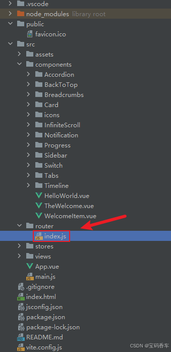
📘编写路由 src\router\index.js
import { createRouter, createWebHistory } from 'vue-router'
import RightClickMenuView from '../views/RightClickMenuView.vue'
import RangePickerView from '../views/RangePickerView.vue'
const router = createRouter({
history: createWebHistory(import.meta.env.BASE_URL),
routes: [
{
path: '/',
name: 'progress',
component: () => import('../views/ProgressView.vue'),
},
{
path: '/tabs',
name: 'tabs',
// route level code-splitting
// this generates a separate chunk (About.[hash].js) for this route
// which is lazy-loaded when the route is visited.
// 标签页(Tabs)
component: () => import('../views/TabsView.vue'),
},
{
path: '/accordion',
name: 'accordion',
// 折叠面板(Accordion)
component: () => import('../views/AccordionView.vue'),
},
{
path: '/timeline',
name: 'timeline',
// 时间线(Timeline)
component: () => import('../views/TimelineView.vue'),
},
{
path: '/backToTop',
name: 'backToTop',
component: () => import('../views/BackToTopView.vue')
},
{
path: '/notification',
name: 'notification',
component: () => import('../views/NotificationView.vue')
},
{
path: '/card',
name: 'card',
component: () => import('../views/CardView.vue')
},
{
path: '/infiniteScroll',
name: 'infiniteScroll',
component: () => import('../views/InfiniteScrollView.vue')
},
{
path: '/switch',
name: 'switch',
component: () => import('../views/SwitchView.vue')
},
{
path: '/sidebar',
name: 'sidebar',
component: () => import('../views/SidebarView.vue')
},
{
path: '/breadcrumbs',
name: 'breadcrumbs',
component: () => import('../views/BreadcrumbsView.vue')
},
{
path: '/masonryLayout',
name: 'masonryLayout',
component: () => import('../views/MasonryLayoutView.vue')
},
{
path: '/rating',
name: 'rating',
component: () => import('../views/RatingView.vue')
},
{
path: '/datePicker',
name: 'datePicker',
component: () => import('../views/DatePickerView.vue')
},
{
path: '/colorPicker',
name: 'colorPicker',
component: () => import('../views/ColorPickerView.vue')
},
{
path: '/rightClickMenu',
name: 'rightClickMenu',
component: RightClickMenuView
},
{
path: '/rangePicker',
name: 'rangePicker',
component: () => import('../views/RangePickerView.vue')
},
{
path: '/navbar',
name: 'navbar',
component: () => import('../views/NavbarView.vue')
},
{
path: '/formValidation',
name: 'formValidation',
component: () => import('../views/FormValidationView.vue')
},
{
path: '/copyToClipboard',
name: 'copyToClipboard',
component: () => import('../views/CopyToClipboardView.vue')
},
{
path: '/clickAnimations',
name: 'clickAnimations',
component: () => import('../views/ClickAnimationsView.vue')
},
{
path: '/thumbnailList',
name: 'thumbnailList',
component: () => import('../views/ThumbnailListView.vue')
},
{
path: '/keyboardShortcuts',
name: 'keyboardShortcuts',
component: () => import('../views/KeyboardShortcutsView.vue')
},
{
path: '/commentSystem',
name: 'commentSystem',
component: () => import('../views/CommentSystemView.vue')
},
{
path: '/qRCode',
name: 'qRCode',
component: () => import('../views/QRCodeView.vue')
},
{
path: '/radioButton',
name: 'radioButton',
component: () => import('../views/RadioButtonView.vue')
},
{
path: '/slider',
name: 'slider',
component: () => import('../views/SliderView.vue')
},
{
path: '/scrollAnimations',
name: 'scrollAnimations',
component: () => import('../views/ScrollAnimationsView.vue')
},
{
path: '/textInputView',
name: 'textInputView',
component: () => import('../views/TextInputView.vue')
},
{
path: '/divider',
name: 'divider',
component: () => import('../views/DividerView.vue')
},
{
path: '/checkbox',
name: 'checkbox',
component: () => import('../views/CheckboxView.vue')
},
{
path: '/tagInput',
name: 'tagInput',
component: () => import('../views/TagInputView.vue')
},
{
path: '/dropdownSelect',
name: 'dropdownSelect',
component: () => import('../views/DropdownSelectView.vue')
},
{
path: '/list',
name: 'list',
component: () => import('../views/ListView.vue')
},
{
path: '/header',
name: 'header',
component: () => import('../views/HeaderView.vue')
},
{
path: '/footer',
name: 'footer',
component: () => import('../views/FooterView.vue')
},
{
path: '/pagination',
name: 'pagination',
component: () => import('../views/PaginationView.vue')
},
{
path: '/floatingActionButton',
name: 'floatingActionButton',
component: () => import('../views/FloatingActionButtonView.vue')
}
],
})
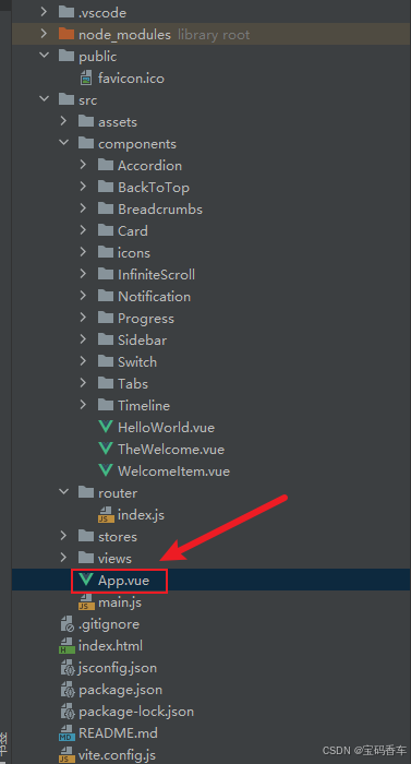
export default router📘编写展示入口 src\App.vue
<script setup>
import { RouterLink, RouterView } from 'vue-router'
import HelloWorld from './components/HelloWorld.vue'
</script>

<template>
  <header>
    <img alt="Vue logo"   src="https://blog.csdn.net/qq_33650655/article/details/@/assets/logo.svg"     />

    <div class="wrapper">
      <HelloWorld msg="You did it!" />
      <nav>
        <RouterLink to="/">Progress</RouterLink>
        <RouterLink to="/tabs">Tabs</RouterLink>
        <RouterLink to="/accordion">Accordion</RouterLink>
        <RouterLink to="/timeline">Timeline</RouterLink>
        <RouterLink to="/backToTop">BackToTop</RouterLink>
        <RouterLink to="/notification">Notification</RouterLink>
        <RouterLink to="/card">Card</RouterLink>
        <RouterLink to="/infiniteScroll">InfiniteScroll</RouterLink>
        <RouterLink to="/switch">Switch</RouterLink>
        <RouterLink to="/sidebar">Sidebar</RouterLink>
        <RouterLink to="/breadcrumbs">Breadcrumbs</RouterLink>
        <RouterLink to="/masonryLayout">MasonryLayout</RouterLink>
        <RouterLink to="/rating">Rating</RouterLink>
        <RouterLink to="/datePicker">DatePicker</RouterLink>
        <RouterLink to="/colorPicker">ColorPicker</RouterLink>
        <RouterLink to="/rightClickMenu">RightClickMenu</RouterLink>
        <RouterLink to="/rangePicker">RangePicker</RouterLink>
        <RouterLink to="/navbar">Navbar</RouterLink>
        <RouterLink to="/formValidation">FormValidation</RouterLink>
        <RouterLink to="/copyToClipboard">CopyToClipboard</RouterLink>
        <RouterLink to="/clickAnimations">ClickAnimations</RouterLink>
        <RouterLink to="/thumbnailList">ThumbnailList</RouterLink>
        <RouterLink to="/keyboardShortcuts">KeyboardShortcuts</RouterLink>
        <RouterLink to="/commentSystem">CommentSystem</RouterLink>
        <RouterLink to="/qRCode">QRCode</RouterLink>
        <RouterLink to="/radioButton">RadioButton</RouterLink>
        <RouterLink to="/slider">Slider</RouterLink>
        <RouterLink to="/scrollAnimations">ScrollAnimations</RouterLink>
        <RouterLink to="/textInputView">TextInput</RouterLink>
        <RouterLink to="/divider">Divider</RouterLink>
        <RouterLink to="/checkbox">Checkbox</RouterLink>
        <RouterLink to="/tagInput">TagInput</RouterLink>
        <RouterLink to="/dropdownSelect">DropdownSelect</RouterLink>
        <RouterLink to="/list">List</RouterLink>
        <RouterLink to="/header">Header</RouterLink>
        <RouterLink to="/footer">Footer</RouterLink>
        <RouterLink to="/pagination">Pagination</RouterLink>
        <RouterLink to="/floatingActionButton">FloatingActionButton</RouterLink>
      </nav>
    </div>
  </header>
  <RouterView />
</template>

<style scoped>
header {
  line-height: 1.5;
  max-height: 100vh;
}

.logo {
  display: block;
  margin: 0 auto 2rem;
}

nav {
  width: 100%;
  font-size: 12px;
  text-align: center;
  margin-top: 2rem;
}

nav a.router-link-exact-active {
  color: var(--color-text);
}

nav a.router-link-exact-active:hover {
  background-color: transparent;
}

nav a {
  display: inline-block;
  padding: 0 1rem;
  border-left: 1px solid var(--color-border);
}

nav a:first-of-type {
  border: 0;
}

@media (min-width: 1024px) {
  header {
    display: flex;
    place-items: center;
    padding-right: calc(var(--section-gap) / 2);
  }

  .logo {
    margin: 0 2rem 0 0;
  }

  header .wrapper {
    display: flex;
    place-items: flex-start;
    flex-wrap: wrap;
  }

  nav {
    text-align: left;
    margin-left: -1rem;
    font-size: 1rem;

    padding: 1rem 0;
    margin-top: 1rem;
  }
}
</style>
总结
通过结合DeepSeek和Vue框架,我们可以高效地实现丝滑的悬浮按钮。DeepSeek提供了丰富的组件库和示例代码,帮助开发者快速找到解决方案,而Vue的响应式机制和组件化开发模式,则使得按钮的实现更加直观和灵活。本文展示了如何利用这两者的优势,创建一个美观且功能强大的悬浮按钮,提升用户体验。无论是初学者还是有经验的开发者,都可以从中受益,加速开发流程,提升项目质量。
本文来源于#宝码香车,由@蜜芽 整理发布。如若内容造成侵权/违法违规/事实不符,请联系本站客服处理!
该文章观点仅代表作者本人,不代表本站立场。本站不承担相关法律责任。
如若转载,请注明出处:https://www.zhanid.com/biancheng/3493.html
")
")

")
")