在现代Web应用中,文本输入框(Text Input)是最常见的用户交互元素之一。一个流畅、响应迅速的文本输入框能够显著提升用户体验。DeepSeek是一款强大的搜索引擎,而Vue.js则以其轻量级和高效性在前端框架中脱颖而出。本文将探讨如何结合DeepSeek和Vue.js,打造一个丝滑的文本输入框,提升用户体验和网站性能。
📚前言
面对这些技术难题,DeepSeek 采取了一系列有效的应对措施。
在算力需求方面,DeepSeek 通过创新的算法和架构设计,努力降低模型对算力的依赖。在模型架构上,采用了混合专家(MoE)架构。这种架构能够根据不同的任务和输入数据,动态地选择最合适的子模型进行处理,从而提高模型的处理效率,减少不必要的计算资源浪费。在处理简单的文本分类任务时,MoE 架构可以快速选择专门针对该任务优化的子模型,避免使用整个大模型进行计算,从而大大降低了算力需求。DeepSeek 还采用了一些先进的训练算法,如自适应学习率调整算法,能够根据模型的训练状态自动调整学习率,提高训练效率,减少训练时间,间接降低了对算力的需求。
📚页面效果
📚指令输入
已经创建好了一个基于Vue3的组合式API的项目(Composition API),并能正常运行起来,请帮我用 Vue3的组合式API(Composition API) 生成一个 文本输入框(Text Input) 的功能组件,所有代码都保存在components/TextInput 下的文件夹中。功能组件的script标签中只有setup属性,使用普通 JavaScript 实现,不使用TypeScript。
功能要有,如下属性:
属性定义
1. 基本属性
value 或 modelValue
用于绑定输入框的值。在 Vue 3 中,使用 v-model 指令时,默认绑定的属性名是 modelValue,可以通过 defineProps 接收该值,方便实现双向数据绑定。
placeholder
输入框的占位文本,当输入框为空时显示,提示用户输入的内容。
disabled
布尔类型属性,用于禁用输入框,用户无法对其进行输入操作。
readonly
布尔类型属性,设置输入框为只读状态,用户可以看到内容但不能编辑。
2. 样式相关属性
size
可以定义输入框的大小,例如 small、medium、large,方便统一管理不同大小的输入框样式。
color
用于设置输入框文本的颜色,支持颜色名称、十六进制值等。
borderColor
用于设置输入框边框的颜色。
3. 验证相关属性
maxlength
限制输入框中允许输入的最大字符数。
minlength
限制输入框中允许输入的最小字符数。
pattern
正则表达式,用于验证输入的内容是否符合指定的格式。
4. 辅助属性
label
输入框的标签文本,显示在输入框旁边,用于描述输入框的用途。
prefix
输入框前缀内容,显示在输入框内部左侧,可用于添加单位等信息。
suffix
输入框后缀内容,显示在输入框内部右侧,可用于添加提示信息等。
事件定义
input
当输入框内容发生变化时触发,可用于实时获取输入框的值并进行处理。
change
当输入框失去焦点且内容发生变化时触发,常用于在用户完成输入后进行一些操作,如提交表单验证。
focus
当输入框获得焦点时触发,可用于实现一些聚焦效果,如显示提示信息。
blur
当输入框失去焦点时触发,可用于在用户离开输入框时进行一些验证或保存操作。
keydown、keyup、keypress
分别在按下按键、释放按键和按下并释放按键时触发,可用于实现快捷键操作或输入验证。
其他
组件复用性:确保组件具有良好的复用性,避免在不同地方使用时需要大量修改代码。可以通过合理的属性和事件设计来实现。
样式定制:提供一些默认样式,但也要允许用户通过自定义类名或样式属性来覆盖默认样式,以满足不同的设计需求。
错误处理与提示:结合验证属性,在输入不符合要求时,提供相应的错误提示信息,增强用户体验。
无障碍支持:遵循无障碍设计原则,为输入框添加必要的 aria 属性,确保残障人士也能正常使用。
文档与示例:编写详细的组件文档,包括属性和事件的说明、使用示例等,方便其他开发者使用。
你有更好的建议也可以添加,要注明。组件定义好后给出5个及以上的调用示例。
下面是现有目录
vueAndDeepseek/
├── src/ # 源代码目录
│ ├── assets/ # 静态资源
│ │ ├── base.css
│ │ ├── main.css
│ │ └── logo.svg
│ ├── components/ # 组件目录
│ │ ├── HelloWorld.vue
│ │ ├── TheWelcome.vue
│ │ ├── WelcomeItem.vue
│ │ ├── Progress/
│ │ │ └── Progress.vue
│ │ ├── Accordion/
│ │ ├── BackToTop/
│ │ ├── Card/
│ │ ├── InfiniteScroll/
│ │ ├── Notification/
│ │ ├── Timeline/
│ │ ├── Switch/
│ │ ├── Tabs/
│ │ ├── Sidebar/
│ │ ├── Breadcrumbs/
│ │ ├── MasonryLayout/
│ │ ├── Rating/
│ │ ├── ColorPicker/
│ │ ├── RightClickMenu/
│ │ ├── RangePicker/
│ │ ├── Navbar/
│ │ ├── FormValidation/
│ │ ├── CopyToClipboard/
│ │ ├── ClickAnimations/
│ │ ├── ThumbnailList/
│ │ ├── KeyboardShortcuts/
│ │ ├── CommentSystem/
│ │ ├── QRCode/
│ │ ├── RadioButton/
│ │ ├── Slider/
│ │ ├── ScrollAnimations/
│ │ ├── TextInput/
│ │ ├── DatePicker/
│ │ └── icons/
│ ├── router/ # 路由配置
│ │ └── index.js
│ ├── stores/ # Pinia 状态管理
│ │ └── counter.js
│ ├── views/ # 页面组件
│ │ ├── ProgressView.vue
│ │ ├── TabsView.vue
│ │ ├── SwitchView.vue
│ │ ├── TimelineView.vue
│ │ ├── NotificationView.vue
│ │ ├── CardView.vue
│ │ ├── InfiniteScrollView.vue
│ │ ├── BackToTopView.vue
│ │ ├── AccordionView.vue
│ │ ├── SidebarView.vue
│ │ ├── BreadcrumbsView.vue
│ │ ├── MasonryLayoutView.vue
│ │ ├── RatingView.vue
│ │ ├── ColorPickerView.vue
│ │ ├── RightClickMenuView.vue
│ │ ├── RangePickerView.vue
│ │ ├── NavbarView.vue
│ │ ├── FormValidationView.vue
│ │ ├── CopyToClipboardView.vue
│ │ ├── ClickAnimationsView.vue
│ │ ├── ThumbnailListView.vue
│ │ ├── KeyboardShortcutsView.vue
│ │ ├── CommentSystemView.vue
│ │ ├── QRCodeView.vue
│ │ ├── RadioButtonView.vue
│ │ ├── SliderView.vue
│ │ ├── ScrollAnimationsView.vue
│ │ ├── TextInputView.vue
│ │ ├── DatePickerView.vue
│ │ └── AboutView.vue
│ ├── App.vue # 根组件
│ └── main.js # 应用入口
├── public/ # 公共资源目录
├── index.html # HTML 模板
├── package.json # 项目配置
├── vite.config.js # Vite 配置
└── node_modules/ # 依赖包目录
📚think
📘组件代码
根据你的需求,我为你创建了支持多种属性和事件的 TextInput 组件。以下是实现步骤和代码:
<!-- components/TextInput/TextInput.vue -->
<template>
<div class="text-input">
<!-- 标签 -->
<label v-if="label" :for="uuid" class="text-input__label">
{{ label }}
</label>
<!-- 输入框容器 -->
<div
:class="[sizeClass, { 'is-disabled': disabled, 'is-readonly': readonly }]"
:
>
<!-- 前缀 -->
<span v-if="prefix" class="text-input__prefix">
{{ prefix }}
</span>
<!-- 输入框主体 -->
<input
:
ref="input"
:value="modelValue"
v-bind="$attrs"
:placeholder="placeholder"
:disabled="disabled"
:readonly="readonly"
:maxlength="maxlength"
:minlength="minlength"
:pattern="pattern"
:aria-label="label || placeholder"
:aria-invalid="isInvalid"
@input="handleInput"
@change="handleChange"
@focus="handleFocus"
@blur="handleBlur"
@keydown="handleKeydown"
@keyup="handleKeyup"
@keypress="handleKeypress"
>
<!-- 后缀 -->
<span v-if="suffix" class="text-input__suffix">
{{ suffix }}
</span>
</div>
</div>
</template>
<script setup>
import { ref, computed, onMounted } from 'vue';
const props = defineProps({
modelValue: { type: [String, Number], default: '' },
placeholder: { type: String, default: '' },
disabled: { type: Boolean, default: false },
readonly: { type: Boolean, default: false },
size: { type: String, default: 'medium', validator: v => ['small', 'medium', 'large'].includes(v) },
color: { type: String, default: '#333' },
borderColor: { type: String, default: '#ccc' },
maxlength: { type: [Number, String], default: null },
minlength: { type: [Number, String], default: null },
pattern: { type: String, default: null },
label: { type: String, default: '' },
prefix: { type: String, default: '' },
suffix: { type: String, default: '' },
});
const emit = defineEmits([
'update:modelValue',
'input',
'change',
'focus',
'blur',
'keydown',
'keyup',
'keypress',
]);
// 生成唯一ID用于无障碍访问
const uuid = ref('');
const generateId = () => `input_${Math.random().toString(36).substr(2, 9)}`;
onMounted(() => { uuid.value = generateId(); });
// 样式计算
const sizeClass = computed(() => `size-${props.size}`);
const containerStyle = computed(() => ({
borderColor: props.borderColor,
color: props.color,
}));
// 验证状态
const isInvalid = ref(false);
// 事件处理
const handleInput = (e) => {
emit('update:modelValue', e.target.value);
emit('input', e.target.value);
validate(e.target.value);
};
const handleChange = (e) => {
emit('change', e.target.value);
};
const handleFocus = (e) => {
emit('focus', e);
};
const handleBlur = (e) => {
emit('blur', e);
};
const handleKeydown = (e) => emit('keydown', e);
const handleKeyup = (e) => emit('keyup', e);
const handleKeypress = (e) => emit('keypress', e);
// 验证逻辑
const validate = (value) => {
if (!props.pattern) return;
const regex = new RegExp(props.pattern);
isInvalid.value = !regex.test(value);
};
</script>
<style scoped>
.text-input {
margin-bottom: 1rem;
width: 100%;
}
.text-input__label {
display: block;
margin-bottom: 0.5rem;
font-weight: 500;
color: var(--input-label-color, #666);
}
.text-input__container {
display: flex;
align-items: center;
border: 1px solid;
border-radius: 4px;
padding: 0 12px;
transition: border-color 0.3s ease;
}
.text-input__container.size-small { height: 32px; font-size: 12px; }
.text-input__container.size-medium { height: 40px; font-size: 14px; }
.text-input__container.size-large { height: 48px; font-size: 16px; }
.text-input__container.is-disabled {
background-color: #f5f5f5;
cursor: not-allowed;
}
.text-input__container.is-readonly {
background-color: #f9f9f9;
}
.text-input__input {
flex: 1;
border: none;
outline: none;
background: transparent;
padding: 0 8px;
width: 100%;
}
.text-input__input:disabled { cursor: not-allowed; }
.text-input__prefix,
.text-input__suffix {
user-select: none;
color: #999;
}
.text-input__prefix { margin-right: 8px; }
.text-input__suffix { margin-left: 8px; }
/* 错误状态 */
.text-input__container[aria-invalid="true"] {
border-color: #ff4444 !important;
animation: shake 0.5s;
}
@keyframes shake {
0%, 100% { transform: translateX(0); }
25% { transform: translateX(-5px); }
75% { transform: translateX(5px); }
}
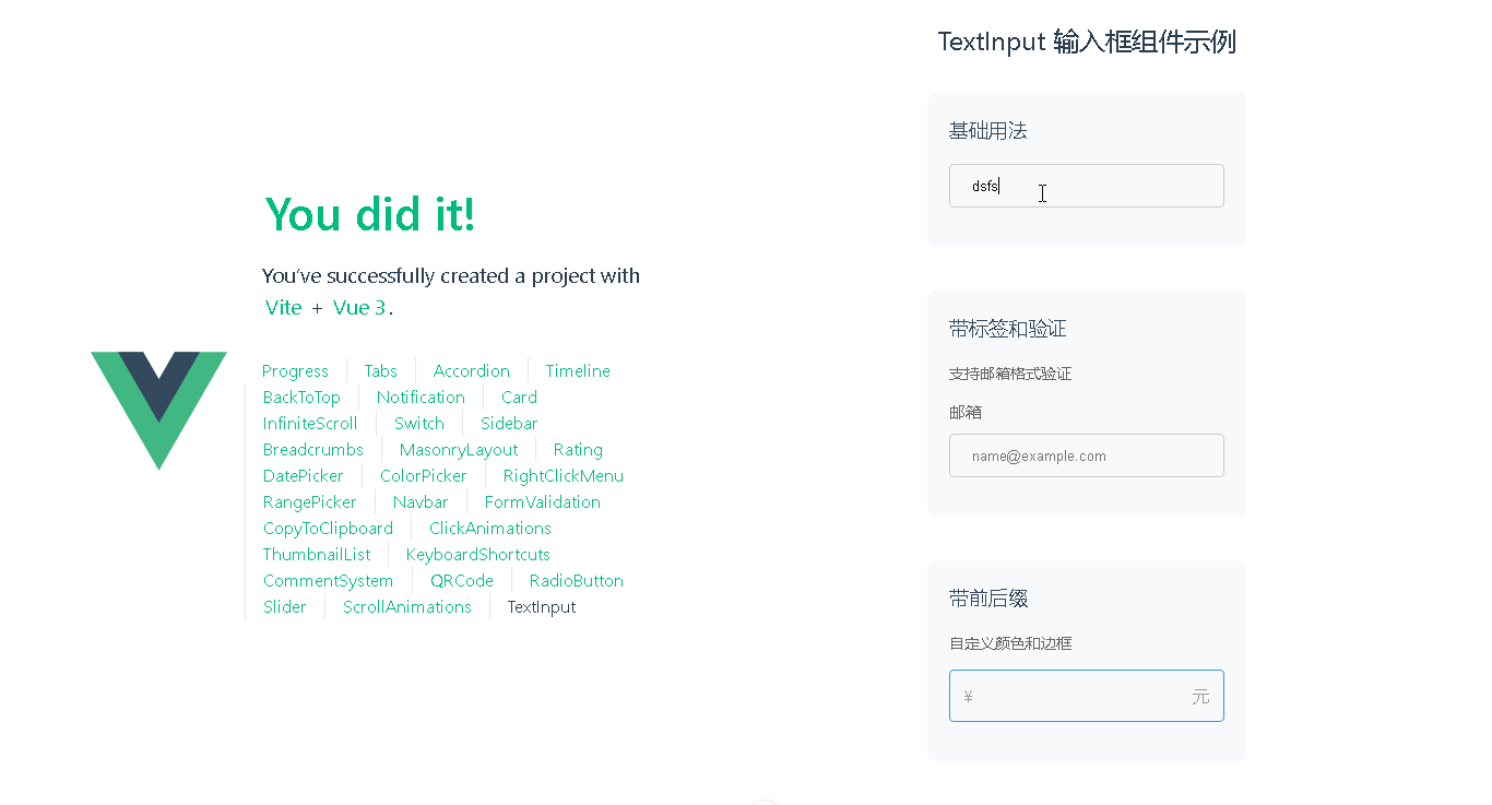
</style>以下是5个使用示例:
<!-- 基础用法 -->
<TextInput v-model="username" placeholder="请输入用户名" />

<!-- 带标签和验证 -->
<TextInput
  v-model="email"
  label="邮箱"
  placeholder="name@example.com"
  pattern="^[a-zA-Z0-9._%+-]+@[a-zA-Z0-9.-]+\.[a-zA-Z]{2,}$"
/>

<!-- 带前后缀 -->
<TextInput
  v-model="price"
  prefix="¥"
  suffix="元"
  size="large"
  color="#2c3e50"
  borderColor="#3498db"
/>

<!-- 禁用状态 -->
<TextInput
  v-model="disabledValue"
  label="禁用输入"
  disabled
  placeholder="无法编辑"
/>

<!-- 带长度限制 -->
<TextInput
  v-model="bio"
  label="个人简介"
  placeholder="最多输入200字"
  maxlength="200"
  size="small"
  borderColor="#27ae60"
/>
附加功能说明:
内置基础验证动画(正则不匹配时抖动效果)
完整的无障碍支持(aria标签、键盘导航)
响应式尺寸控制(small/medium/large)
样式可扩展(通过CSS变量覆盖默认样式)
支持原生输入框所有属性(通过v-bind="$attrs"继承)
建议后续扩展方向:
添加自定义错误提示插槽
支持密码可见性切换
添加加载状态指示器
支持多行文本输入(textarea)
添加自动完成功能
📚代码测试
运行正常
📚测试代码正常跑通,附其他基本代码
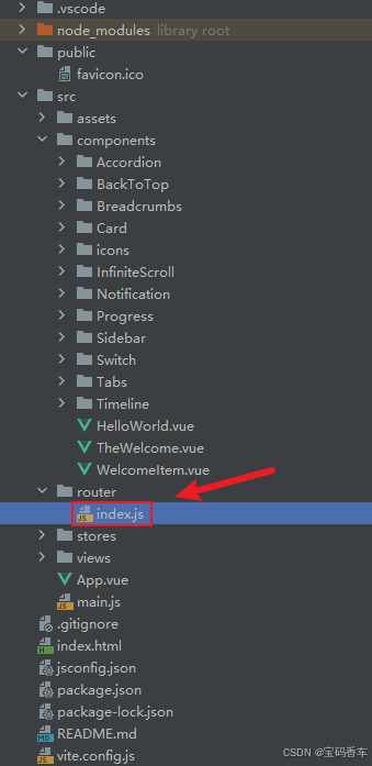
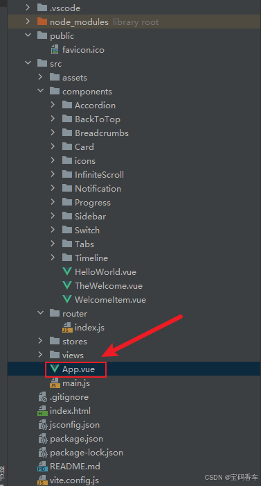
添加路由
页面展示入口
📘编写路由 src\router\index.js
import { createRouter, createWebHistory } from 'vue-router'
import RightClickMenuView from '../views/RightClickMenuView.vue'
import RangePickerView from '../views/RangePickerView.vue'


const router = createRouter({
  history: createWebHistory(import.meta.env.BASE_URL),
  routes: [
    {
      path: '/',
      name: 'progress',
      component:  () => import('../views/ProgressView.vue'),
    },
    {
      path: '/tabs',
      name: 'tabs',
      // route level code-splitting
      // this generates a separate chunk (About.[hash].js) for this route
      // which is lazy-loaded when the route is visited.
      // 标签页(Tabs)
      component: () => import('../views/TabsView.vue'),
    },
    {
      path: '/accordion',
      name: 'accordion',
      // 折叠面板(Accordion)
      component: () => import('../views/AccordionView.vue'),
    },
    {
      path: '/timeline',
      name: 'timeline',
      // 时间线(Timeline)
      component: () => import('../views/TimelineView.vue'),
    },
    {
      path: '/backToTop',
      name: 'backToTop',
      component: () => import('../views/BackToTopView.vue')
    },
    {
      path: '/notification',
      name: 'notification',
      component: () => import('../views/NotificationView.vue')
    },
    {
      path: '/card',
      name: 'card',
      component: () => import('../views/CardView.vue')
    },
    {
      path: '/infiniteScroll',
      name: 'infiniteScroll',
      component: () => import('../views/InfiniteScrollView.vue')
    },
    {
      path: '/switch',
      name: 'switch',
      component: () => import('../views/SwitchView.vue')
    },
    {
      path: '/sidebar',
      name: 'sidebar',
      component: () => import('../views/SidebarView.vue')
    },
    {
      path: '/breadcrumbs',
      name: 'breadcrumbs',
      component: () => import('../views/BreadcrumbsView.vue')
    },
    {
      path: '/masonryLayout',
      name: 'masonryLayout',
      component: () => import('../views/MasonryLayoutView.vue')
    },
    {
      path: '/rating',
      name: 'rating',
      component: () => import('../views/RatingView.vue')
    },
    {
      path: '/datePicker',
      name: 'datePicker',
      component: () => import('../views/DatePickerView.vue')
    },
    {
      path: '/colorPicker',
      name: 'colorPicker',
      component: () => import('../views/ColorPickerView.vue')
    },
    {
      path: '/rightClickMenu',
      name: 'rightClickMenu',
      component: RightClickMenuView
    },
    {
      path: '/rangePicker',
      name: 'rangePicker',
      component: () => import('../views/RangePickerView.vue')
    },
    {
      path: '/navbar',
      name: 'navbar',
      component: () => import('../views/NavbarView.vue')
    },
    {
      path: '/formValidation',
      name: 'formValidation',
      component: () => import('../views/FormValidationView.vue')
    },
    {
      path: '/copyToClipboard',
      name: 'copyToClipboard',
      component: () => import('../views/CopyToClipboardView.vue')
    },
    {
      path: '/clickAnimations',
      name: 'clickAnimations',
      component: () => import('../views/ClickAnimationsView.vue')
    },
    {
      path: '/thumbnailList',
      name: 'thumbnailList',
      component: () => import('../views/ThumbnailListView.vue')
    },
    {
      path: '/keyboardShortcuts',
      name: 'keyboardShortcuts',
      component: () => import('../views/KeyboardShortcutsView.vue')
    },
    {
      path: '/commentSystem',
      name: 'commentSystem',
      component: () => import('../views/CommentSystemView.vue')
    },
    {
      path: '/qRCode',
      name: 'qRCode',
      component: () => import('../views/QRCodeView.vue')
    },
    {
      path: '/radioButton',
      name: 'radioButton',
      component: () => import('../views/RadioButtonView.vue')
    },
    {
      path: '/slider',
      name: 'slider',
      component: () => import('../views/SliderView.vue')
    },
    {
      path: '/scrollAnimations',
      name: 'scrollAnimations',
      component: () => import('../views/ScrollAnimationsView.vue')
    },
    {
      path: '/textInputView',
      name: 'textInputView',
      component: () => import('../views/TextInputView.vue')
    }
  ],
})

export default router
📘编写展示入口 src\App.vue
<script setup>
import { RouterLink, RouterView } from 'vue-router'
import HelloWorld from './components/HelloWorld.vue'
</script>

<template>
  <header>
    <img alt="Vue logo"   src="https://blog.csdn.net/qq_33650655/article/details/@/assets/logo.svg"     />

    <div class="wrapper">
      <HelloWorld msg="You did it!" />
      <nav>
        <RouterLink to="/">Progress</RouterLink>
        <RouterLink to="/tabs">Tabs</RouterLink>
        <RouterLink to="/accordion">Accordion</RouterLink>
        <RouterLink to="/timeline">Timeline</RouterLink>
        <RouterLink to="/backToTop">BackToTop</RouterLink>
        <RouterLink to="/notification">Notification</RouterLink>
        <RouterLink to="/card">Card</RouterLink>
        <RouterLink to="/infiniteScroll">InfiniteScroll</RouterLink>
        <RouterLink to="/switch">Switch</RouterLink>
        <RouterLink to="/sidebar">Sidebar</RouterLink>
        <RouterLink to="/breadcrumbs">Breadcrumbs</RouterLink>
        <RouterLink to="/masonryLayout">MasonryLayout</RouterLink>
        <RouterLink to="/rating">Rating</RouterLink>
        <RouterLink to="/datePicker">DatePicker</RouterLink>
        <RouterLink to="/colorPicker">ColorPicker</RouterLink>
        <RouterLink to="/rightClickMenu">RightClickMenu</RouterLink>
        <RouterLink to="/rangePicker">RangePicker</RouterLink>
        <RouterLink to="/navbar">Navbar</RouterLink>
        <RouterLink to="/formValidation">FormValidation</RouterLink>
        <RouterLink to="/copyToClipboard">CopyToClipboard</RouterLink>
        <RouterLink to="/clickAnimations">ClickAnimations</RouterLink>
        <RouterLink to="/thumbnailList">ThumbnailList</RouterLink>
        <RouterLink to="/keyboardShortcuts">KeyboardShortcuts</RouterLink>
        <RouterLink to="/commentSystem">CommentSystem</RouterLink>
        <RouterLink to="/qRCode">QRCode</RouterLink>
        <RouterLink to="/radioButton">RadioButton</RouterLink>
        <RouterLink to="/slider">Slider</RouterLink>
        <RouterLink to="/scrollAnimations">ScrollAnimations</RouterLink>
        <RouterLink to="/textInputView">TextInput</RouterLink>
      </nav>
    </div>
  </header>

  <RouterView />
</template>

<style scoped>
header {
  line-height: 1.5;
  max-height: 100vh;
}

.logo {
  display: block;
  margin: 0 auto 2rem;
}

nav {
  width: 100%;
  font-size: 12px;
  text-align: center;
  margin-top: 2rem;
}

nav a.router-link-exact-active {
  color: var(--color-text);
}

nav a.router-link-exact-active:hover {
  background-color: transparent;
}

nav a {
  display: inline-block;
  padding: 0 1rem;
  border-left: 1px solid var(--color-border);
}

nav a:first-of-type {
  border: 0;
}

@media (min-width: 1024px) {
  header {
    display: flex;
    place-items: center;
    padding-right: calc(var(--section-gap) / 2);
  }

  .logo {
    margin: 0 2rem 0 0;
  }

  header .wrapper {
    display: flex;
    place-items: flex-start;
    flex-wrap: wrap;
  }

  nav {
    text-align: left;
    margin-left: -1rem;
    font-size: 1rem;

    padding: 1rem 0;
    margin-top: 1rem;
  }
}
</style>
📚页面效果
总结
通过结合DeepSeek的强大搜索功能和Vue.js的高效性,我们成功打造了一个丝滑的文本输入框。这个文本输入框不仅提升了用户体验,还优化了网站的性能。希望本文的介绍能为你的项目提供有价值的参考,帮助你在Web开发的道路上更进一步。无论是新手还是有经验的开发者,都可以从中受益,创造出更加优秀的Web应用。
本文来源于#宝码香车,由@蜜芽 整理发布。如若内容造成侵权/违法违规/事实不符,请联系本站客服处理!
该文章观点仅代表作者本人,不代表本站立场。本站不承担相关法律责任。
如若转载,请注明出处:https://www.zhanid.com/biancheng/3352.html
")
")
")