在现代Web开发中,导航栏(Navbar)作为用户与网站交互的重要组成部分,其流畅性和用户体验至关重要。DeepSeek是一款强大的搜索引擎,而Vue.js则以其轻量级和高效性在前端框架中脱颖而出。本文将探讨如何结合DeepSeek和Vue.js,打造一个丝滑的导航栏,提升用户体验和网站性能。
📚前言
DeepSeek 在公募基金行业的投资研究中,能够帮助研究员和基金经理从海量信息中快速提取有价值的信息,提升投资决策的效率和准确性;在产品销售方面,能够通过个性化推荐和智能客服,提升客户体验和销售效率;在风控合规方面,能够更精准地识别和防范风险。
📚页面效果
📚指令输入
已经创建好了一个基于Vue3的组合式API的项目(Composition API),并能正常运行起来,请帮我用 Vue3的组合式API(Composition API) 生成一个 导航栏(Navbar) 的功能组件,所有代码都保存在components/Navbar 下的文件夹中。功能组件的script标签中只有setup属性,使用普通 JavaScript 实现,不使用TypeScript。
功能要有,如下属性:
属性定义
1. 导航栏样式相关
backgroundColor:用于设置导航栏的背景颜色,可以接收十六进制颜色码、RGB 或 RGBA 值等字符串类型的值,方便根据不同的页面主题调整导航栏背景。
textColor:设置导航栏内文字的颜色,同样接收颜色字符串,以确保文字与背景颜色搭配协调,保证可读性。
height:指定导航栏的高度,接收带单位的字符串(如 '50px')或数字(默认单位为 px),满足不同布局对导航栏高度的需求。
fixed:布尔类型属性,用于决定导航栏是否固定在页面顶部。设置为 true 时,导航栏会固定在页面顶部,滚动页面时不会消失。
2. 导航项相关
items:这是一个数组类型的属性,数组中的每个元素代表一个导航项。每个导航项可以是一个对象,包含 label(导航项显示的文本)、href(导航项的链接地址)、icon(导航项的图标,可使用图标库的类名或图片地址)等信息,方便动态生成导航项。
activeIndex:数字类型,用于指定当前激活的导航项的索引,便于在页面加载或切换时高亮显示当前选中的导航项。
3. 响应式相关
breakpoint:接收一个数字或带单位的字符串,表示响应式设计的断点。当屏幕宽度小于该值时,导航栏可以切换为移动端样式,如折叠菜单。
collapsed:布尔类型,用于控制导航栏在移动端是否折叠。通常在屏幕宽度小于 breakpoint 时生效,用户可以通过点击菜单按钮来切换该属性的值。
4. 对齐方式相关
alignment:字符串类型,可选值可以是 'left'、'center'、'right',用于设置导航项的水平对齐方式,满足不同的布局需求。
事件定义
1. 导航项点击事件
@item-click:当用户点击导航项时触发该事件,事件参数可以包含被点击导航项的信息(如索引、链接地址等),方便在父组件中处理导航跳转或其他逻辑。
2. 菜单折叠切换事件
@collapse-toggle:在移动端模式下,当用户点击菜单按钮切换导航栏的折叠状态时触发该事件,可用于在父组件中记录或响应菜单状态的变化。
其他建议
1. 可访问性
确保导航栏在使用键盘导航时也能正常操作,为导航项添加适当的 tabindex 属性,方便使用键盘的用户进行操作。
为导航栏中的按钮和链接添加清晰的 aria-label 属性,提高屏幕阅读器等辅助设备的可访问性。
2. 动画效果
为导航栏的展开和折叠操作添加动画效果,如淡入淡出、滑动等,提升用户体验。可以使用 Vue 3 的过渡组件(Transition 和 TransitionGroup)来实现这些动画效果。
3. 图标支持
支持使用图标库(如 Font Awesome、Element Plus Icons 等)中的图标作为导航项的图标,提供更好的视觉效果。可以通过属性传递图标的类名或组件来实现。
4. 扩展性
考虑将导航栏的部分元素(如菜单按钮、搜索框等)设计为可自定义的插槽,方便用户根据自己的需求进行扩展和定制。例如,用户可以通过插槽替换默认的菜单按钮为自定义的图标或组件。
你有更好的建议也可以添加,要注明。组件定义好后给出3个及以上的调用示例。
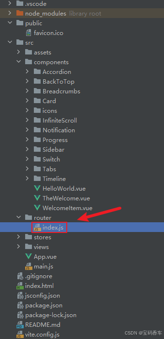
下面是现有目录
vueAndDeepseek/
├── src/ # 源代码目录
│ ├── assets/ # 静态资源
│ │ ├── base.css
│ │ ├── main.css
│ │ └── logo.svg
│ ├── components/ # 组件目录
│ │ ├── HelloWorld.vue
│ │ ├── TheWelcome.vue
│ │ ├── WelcomeItem.vue
│ │ ├── Progress/
│ │ │ └── Progress.vue
│ │ ├── Accordion/
│ │ ├── BackToTop/
│ │ ├── Card/
│ │ ├── InfiniteScroll/
│ │ ├── Notification/
│ │ ├── Timeline/
│ │ ├── Switch/
│ │ ├── Tabs/
│ │ ├── Sidebar/
│ │ ├── Breadcrumbs/
│ │ ├── MasonryLayout/
│ │ ├── Rating/
│ │ ├── ColorPicker/
│ │ ├── RightClickMenu/
│ │ ├── RangePicker/
│ │ ├── Navbar/
│ │ ├── DatePicker/
│ │ └── icons/
│ ├── router/ # 路由配置
│ │ └── index.js
│ ├── stores/ # Pinia 状态管理
│ │ └── counter.js
│ ├── views/ # 页面组件
│ │ ├── ProgressView.vue
│ │ ├── TabsView.vue
│ │ ├── SwitchView.vue
│ │ ├── TimelineView.vue
│ │ ├── NotificationView.vue
│ │ ├── CardView.vue
│ │ ├── InfiniteScrollView.vue
│ │ ├── BackToTopView.vue
│ │ ├── AccordionView.vue
│ │ ├── SidebarView.vue
│ │ ├── BreadcrumbsView.vue
│ │ ├── MasonryLayoutView.vue
│ │ ├── RatingView.vue
│ │ ├── ColorPickerView.vue
│ │ ├── RightClickMenuView.vue
│ │ ├── RangePickerView.vue
│ │ ├── NavbarView.vue
│ │ ├── DatePickerView.vue
│ │ └── AboutView.vue
│ ├── App.vue # 根组件
│ └── main.js # 应用入口
├── public/ # 公共资源目录
├── index.html # HTML 模板
├── package.json # 项目配置
├── vite.config.js # Vite 配置
└── node_modules/ # 依赖包目录
📚think
嗯,用户需要我帮他们用Vue3的组合式API写一个导航栏组件,所有代码放在components/Navbar文件夹下。首先,我需要理解他们的需求。他们列出了很多属性,包括样式、导航项、响应式、对齐方式等,还有事件和其他建议,比如可访问性、动画、图标支持和扩展性。
首先,我应该考虑组件的结构。用户要求script标签使用setup属性,普通JavaScript,所以不需要TypeScript。组件需要接收props,处理响应式,比如breakpoint和collapsed来控制移动端菜单的折叠。还有事件,比如点击导航项和切换折叠状态。
接下来,属性部分。backgroundColor、textColor这些样式相关的prop需要绑定到内联样式。height可能需要处理数字自动加px单位。fixed属性用CSS的position: fixed。items数组用来生成导航链接,activeIndex高亮当前项。breakpoint可能要用window.innerWidth来检测屏幕宽度变化,这里可能需要用resize事件监听,并在组件卸载时移除监听器。alignment控制导航项的对齐方式,比如flex的justify-content。
然后事件部分,当用户点击导航项时,触发item-click事件,传递相关信息。折叠状态变化时触发collapse-toggle,同时需要更新内部的isCollapsed状态,可能用v-model:collapsed的语法,或者emit事件让父组件处理。
可访问性方面,需要添加tabindex和aria-label。比如菜单按钮应该有aria-label描述其作用,导航项应该有tabindex=0以便键盘导航。动画效果可以用Vue的Transition组件来实现折叠菜单的滑动效果。
图标支持方面,用户可能使用图标类名或者图片,所以item.icon可以放在i标签或者img标签里,根据传入的内容判断。扩展性方面,可能需要提供插槽,比如在导航栏左右两侧添加自定义内容,或者替换菜单按钮的图标。
然后,我需要考虑响应式设计。当屏幕宽度小于breakpoint时,显示菜单按钮,隐藏导航项,点击按钮展开折叠的菜单。这里可以用window.matchMedia来监听屏幕变化,或者用计算属性动态判断。collapsed属性控制菜单是否显示,同时需要emit事件通知父组件状态变化。
在代码实现时,setup函数里需要处理props,计算样式,处理点击事件,监听窗口resize事件,并根据breakpoint判断是否切换到移动端视图。activeIndex用于高亮当前项,点击导航项时更新activeIndex并触发事件。
样式部分,需要写scoped的CSS,处理固定定位,高度,背景颜色,文字颜色,对齐方式。移动端样式下,菜单可能垂直排列,绝对定位,动画过渡高度或透明度。
调用示例部分,用户需要至少三个例子,比如基本用法、固定导航栏、自定义样式和响应式断点。要展示不同的props配置,比如设置背景色、高度、固定,传入items数组,处理点击事件,以及使用图标类名。
可能遇到的难点:处理breakpoint的单位,比如用户可能传入数字(默认px)或者带单位的字符串,需要解析。响应式监听可能需要防抖处理resize事件。动画效果需要平滑,可能使用transform或max-height过渡。此外,确保键盘事件处理,比如按下Enter键触发点击事件。
测试时要注意不同屏幕尺寸下的表现,确保折叠功能正常,样式正确应用。同时,可访问性检查,比如屏幕阅读器是否能正确读取标签。
最后,按照用户目录结构,组件应该放在components/Navbar文件夹下,可能是一个Navbar.vue文件。调用示例放在NavbarView.vue中,展示不同的使用场景。
📘组件代码
我将按照您的要求创建一个功能完善的导航栏组件,并提供调用示例。以下是组件的实现:
vueAndDeepseek/src/components/Navbar/Navbar.vue
<template>
<nav
:
:class="{ 'navbar--fixed': fixed }"
>
<div class="navbar__container">
<!-- 左侧插槽 -->
<div class="navbar__left">
<slot name="left"></slot>
</div>
<!-- 导航项 -->
<div
:
:
>
<Transition name="slide">
<ul
v-show="shouldShowMenu"
>
<li
v-for="(item, index) in items"
:key="index"
:class="{ 'navbar__item--active': index === activeIndex }"
>
<a
:href="https://blog.csdn.net/qq_33650655/article/details/item.href"
@click="handleItemClick(index, $event)"
:tabindex="isMobile ? (collapsed ? -1 : 0) : 0"
>
<span class="navbar__icon">
<i v-if="item.icon && !item.icon.includes('/')" :class="item.icon"></i>
<img v-else-if="item.icon" :src="https://blog.csdn.net/qq_33650655/article/details/item.icon" alt="icon">
</span>
<span class="navbar__label">{{ item.label }}</span>
</a>
</li>
</ul>
</Transition>
</div>
<!-- 右侧插槽和菜单按钮 -->
<div class="navbar__right">
<slot name="right"></slot>
<button
v-if="isMobile"
@click="toggleCollapse"
:aria-label="collapsed ? '展开菜单' : '折叠菜单'"
>
<svg viewBox="0 0 24 24">
<path d="M3 18h18v-2H3v2zm0-5h18v-2H3v2zm0-7v2h18V6H3z"/>
</svg>
</button>
</div>
</div>
</nav>
</template>
<script setup>
import { ref, computed, watchEffect, onMounted, onUnmounted } from 'vue'
const props = defineProps({
backgroundColor: { type: String, default: '#ffffff' },
textColor: { type: String, default: '#333333' },
height: { type: [String, Number], default: '60px' },
fixed: { type: Boolean, default: false },
items: { type: Array, default: () => [] },
activeIndex: { type: Number, default: -1 },
breakpoint: { type: [String, Number], default: 768 },
collapsed: { type: Boolean, default: true },
alignment: { type: String, default: 'left', validator: v => ['left', 'center', 'right'].includes(v) }
})
const emit = defineEmits(['item-click', 'collapse-toggle'])
// 响应式状态
const isMobile = ref(false)
const isCollapsed = ref(props.collapsed)
const windowWidth = ref(window.innerWidth)
// 计算属性
const computedHeight = computed(() =>
typeof props.height === 'number' ? `${props.height}px` : props.height
)
const alignmentClass = computed(() => `navbar__items--${props.alignment}`)
const navStyles = computed(() => ({
backgroundColor: props.backgroundColor,
color: props.textColor,
height: computedHeight.value
}))
const shouldShowMenu = computed(() =>
!isMobile.value || (isMobile.value && !isCollapsed.value)
)
// 方法
const handleItemClick = (index, event) => {
event.preventDefault()
emit('item-click', { index, href: props.items[index].href })
}
const toggleCollapse = () => {
isCollapsed.value = !isCollapsed.value
emit('collapse-toggle', isCollapsed.value)
}
const checkBreakpoint = () => {
const breakpointValue = typeof props.breakpoint === 'string'
? parseInt(props.breakpoint, 10)
: props.breakpoint
isMobile.value = windowWidth.value < breakpointValue
}
// 生命周期
const handleResize = () => {
windowWidth.value = window.innerWidth
checkBreakpoint()
}
onMounted(() => {
window.addEventListener('resize', handleResize)
checkBreakpoint()
})
onUnmounted(() => {
window.removeEventListener('resize', handleResize)
})
watchEffect(() => {
isCollapsed.value = props.collapsed
})
</script>
<style scoped>
.navbar {
position: relative;
width: 100%;
transition: all 0.3s ease;
}
.navbar--fixed {
position: fixed;
top: 0;
left: 0;
right: 0;
z-index: 1000;
}
.navbar__container {
display: flex;
justify-content: space-between;
align-items: center;
height: 100%;
max-width: 1200px;
margin: 0 auto;
padding: 0 20px;
}
.navbar__items {
display: flex;
flex-grow: 1;
}
.navbar__items--left { justify-content: flex-start; }
.navbar__items--center { justify-content: center; }
.navbar__items--right { justify-content: flex-end; }
.navbar__list {
display: flex;
list-style: none;
margin: 0;
padding: 0;
}
.navbar__item {
position: relative;
margin: 0 15px;
}
.navbar__link {
display: flex;
align-items: center;
color: inherit;
text-decoration: none;
padding: 10px;
transition: color 0.3s ease;
}
.navbar__link:hover,
.navbar__item--active .navbar__link {
opacity: 0.8;
}
.navbar__icon {
margin-right: 8px;
}
.navbar__toggle {
background: none;
border: none;
cursor: pointer;
padding: 10px;
}
.navbar__hamburger {
width: 24px;
height: 24px;
fill: currentColor;
}
@media (max-width: 768px) {
.navbar__items {
position: absolute;
top: 100%;
left: 0;
right: 0;
background: inherit;
flex-direction: column;
overflow: hidden;
transition: max-height 0.3s ease;
}
.navbar__list {
flex-direction: column;
padding: 10px 20px;
}
.navbar__item {
margin: 5px 0;
}
.slide-enter-active,
.slide-leave-active {
transition: max-height 0.3s ease;
}
.slide-enter-from,
.slide-leave-to {
max-height: 0;
}
.slide-enter-to,
.slide-leave-from {
max-height: 500px;
}
}
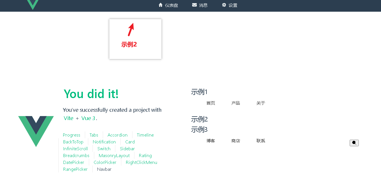
</style>以下是三个调用示例:
基本用法(在 NavbarView.vue 中):
<template>
  <Navbar
    :items="[
      { label: '首页', href: '/' },
      { label: '产品', href: '/products' },
      { label: '关于', href: '/about' }
    ]"
    active-index="0"
    @item-click="handleItemClick"
  />
</template>

<script setup>
import Navbar from '@/components/Navbar/Navbar.vue'

const handleItemClick = (payload) => {
  console.log('导航项点击:', payload)
  // 实际使用中可以在此处处理路由跳转
}
</script>
固定导航栏带图标:
<template>
  <Navbar
    fixed
    background-color="#2c3e50"
    text-color="#ecf0f1"

    :items="[
      { label: '仪表盘', href: '#', icon: 'fas fa-home' },
      { label: '消息', href: '#', icon: 'fas fa-envelope' },
      { label: '设置', href: '#', icon: 'fas fa-cog' }
    ]"
    alignment="center"
  >
    <template #left>
      <img src="https://blog.csdn.net/qq_33650655/article/details/@/assets/logo.svg" alt="Logo" style="height: 40px">
    </template>
  </Navbar>
</template>
响应式带折叠功能:
<template>
  <Navbar
    :breakpoint="640"
    v-model:collapsed="isCollapsed"
    :items="navItems"
    background-color="#fff"
    text-color="#333"
    @collapse-toggle="handleCollapse"
  >
    <template #right>
      <button class="search-button">
        <i class="fas fa-search"></i>
      </button>
    </template>
  </Navbar>
</template>

<script setup>
import { ref } from 'vue'

const isCollapsed = ref(true)
const navItems = ref([
  { label: '博客', href: '/blog' },
  { label: '商店', href: '/shop' },
  { label: '联系', href: '/contact' }
])

const handleCollapse = (collapsed) => {
  console.log('菜单状态:', collapsed ? '已折叠' : '已展开')
}
</script>
补充建议:
键盘导航增强:可以在导航项上添加键盘事件监听(如 Enter 键触发点击)
滚动行为优化:固定导航栏时自动为 body 添加 padding-top 防止内容被遮挡
主题支持:可以添加 CSS 变量支持,方便主题切换
性能优化:对 resize 事件添加防抖处理
SEO 优化:为导航链接添加 rel 属性支持
组件具有以下扩展能力:
通过 #left 和 #right 插槽添加自定义内容
支持 Font Awesome 等图标库(通过 icon 属性)
支持自定义断点响应逻辑
支持通过 CSS 类名覆盖样式
使用时需要根据实际项目需求添加相应的图标库 CSS 或调整断点值。
📚代码测试
正常
📚测试代码正常跑通,附其他基本代码
添加路由
页面展示入口
📘编写路由 src\router\index.js
import { createRouter, createWebHistory } from 'vue-router'
import RightClickMenuView from '../views/RightClickMenuView.vue'
import RangePickerView from '../views/RangePickerView.vue'
const router = createRouter({
history: createWebHistory(import.meta.env.BASE_URL),
routes: [
{
path: '/',
name: 'progress',
component: () => import('../views/ProgressView.vue'),
},
{
path: '/tabs',
name: 'tabs',
// route level code-splitting
// this generates a separate chunk (About.[hash].js) for this route
// which is lazy-loaded when the route is visited.
// 标签页(Tabs)
component: () => import('../views/TabsView.vue'),
},
{
path: '/accordion',
name: 'accordion',
// 折叠面板(Accordion)
component: () => import('../views/AccordionView.vue'),
},
{
path: '/timeline',
name: 'timeline',
// 时间线(Timeline)
component: () => import('../views/TimelineView.vue'),
},
{
path: '/backToTop',
name: 'backToTop',
component: () => import('../views/BackToTopView.vue')
},
{
path: '/notification',
name: 'notification',
component: () => import('../views/NotificationView.vue')
},
{
path: '/card',
name: 'card',
component: () => import('../views/CardView.vue')
},
{
path: '/infiniteScroll',
name: 'infiniteScroll',
component: () => import('../views/InfiniteScrollView.vue')
},
{
path: '/switch',
name: 'switch',
component: () => import('../views/SwitchView.vue')
},
{
path: '/sidebar',
name: 'sidebar',
component: () => import('../views/SidebarView.vue')
},
{
path: '/breadcrumbs',
name: 'breadcrumbs',
component: () => import('../views/BreadcrumbsView.vue')
},
{
path: '/masonryLayout',
name: 'masonryLayout',
component: () => import('../views/MasonryLayoutView.vue')
},
{
path: '/rating',
name: 'rating',
component: () => import('../views/RatingView.vue')
},
{
path: '/datePicker',
name: 'datePicker',
component: () => import('../views/DatePickerView.vue')
},
{
path: '/colorPicker',
name: 'colorPicker',
component: () => import('../views/ColorPickerView.vue')
},
{
path: '/rightClickMenu',
name: 'rightClickMenu',
component: RightClickMenuView
},
{
path: '/rangePicker',
name: 'rangePicker',
component: () => import('../views/RangePickerView.vue')
},
{
path: '/navbar',
name: 'navbar',
component: () => import('../views/NavbarView.vue')
}
],
})
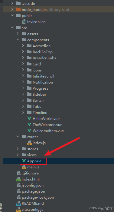
export default router📘编写展示入口 src\App.vue
<script setup>
import { RouterLink, RouterView } from 'vue-router'
import HelloWorld from './components/HelloWorld.vue'
</script>

<template>
  <header>
    <img alt="Vue logo"   src="https://blog.csdn.net/qq_33650655/article/details/@/assets/logo.svg"     />

    <div class="wrapper">
      <HelloWorld msg="You did it!" />
      <nav>
        <RouterLink to="/">Progress</RouterLink>
        <RouterLink to="/tabs">Tabs</RouterLink>
        <RouterLink to="/accordion">Accordion</RouterLink>
        <RouterLink to="/timeline">Timeline</RouterLink>
        <RouterLink to="/backToTop">BackToTop</RouterLink>
        <RouterLink to="/notification">Notification</RouterLink>
        <RouterLink to="/card">Card</RouterLink>
        <RouterLink to="/infiniteScroll">InfiniteScroll</RouterLink>
        <RouterLink to="/switch">Switch</RouterLink>
        <RouterLink to="/sidebar">Sidebar</RouterLink>
        <RouterLink to="/breadcrumbs">Breadcrumbs</RouterLink>
        <RouterLink to="/masonryLayout">MasonryLayout</RouterLink>
        <RouterLink to="/rating">Rating</RouterLink>
        <RouterLink to="/datePicker">DatePicker</RouterLink>
        <RouterLink to="/colorPicker">ColorPicker</RouterLink>
        <RouterLink to="/rightClickMenu">RightClickMenu</RouterLink>
        <RouterLink to="/rangePicker">RangePicker</RouterLink>
        <RouterLink to="/navbar">Navbar</RouterLink>
      </nav>
    </div>
  </header>

  <RouterView />
</template>

<style scoped>
header {
  line-height: 1.5;
  max-height: 100vh;
}

.logo {
  display: block;
  margin: 0 auto 2rem;
}

nav {
  width: 100%;
  font-size: 12px;
  text-align: center;
  margin-top: 2rem;
}

nav a.router-link-exact-active {
  color: var(--color-text);
}

nav a.router-link-exact-active:hover {
  background-color: transparent;
}

nav a {
  display: inline-block;
  padding: 0 1rem;
  border-left: 1px solid var(--color-border);
}

nav a:first-of-type {
  border: 0;
}

@media (min-width: 1024px) {
  header {
    display: flex;
    place-items: center;
    padding-right: calc(var(--section-gap) / 2);
  }

  .logo {
    margin: 0 2rem 0 0;
  }

  header .wrapper {
    display: flex;
    place-items: flex-start;
    flex-wrap: wrap;
  }

  nav {
    text-align: left;
    margin-left: -1rem;
    font-size: 1rem;

    padding: 1rem 0;
    margin-top: 1rem;
  }
}
</style>
📚页面效果
总结
通过结合DeepSeek的强大搜索功能和Vue.js的高效性,我们成功打造了一个丝滑的导航栏。这个导航栏不仅提升了用户体验,还优化了网站的性能。希望本文的介绍能为你的项目提供有价值的参考,帮助你在Web开发的道路上更进一步。无论是新手还是有经验的开发者,都可以从中受益,创造出更加优秀的Web应用。
本文来源于#宝码香车,由@蜜芽 整理发布。如若内容造成侵权/违法违规/事实不符,请联系本站客服处理!
该文章观点仅代表作者本人,不代表本站立场。本站不承担相关法律责任。
如若转载,请注明出处:https://www.zhanid.com/biancheng/3351.html
")
")
")